Page 1
Last updated 4 November 2019
Scroll through this document to see a description of all the great new features & content released in v16.
If you have an active subscription to Xara Designer Pro+ (available standalone or included in Xara Cloud Pro+,
our great value bundle of Xara Cloud and Designer Pro+) purchased from Xara, then these updates are free. If
you are an owner of an older version purchased from Magix, then check out our current offers on upgrades.
Once you have v16 or the v16 trial installed you can download a demo doc for some of the new features
(including color palette from photo and auto-fitting text) here.
You can find Release Notes for the earlier v15 here.
You can see details on updates in the later v17 here.


XARA
DESIGNER PRO X
V16 Release Notes

XARA
DESIGNER PRO X
V16 Release Notes
Contents
Text Improvements
4
Widows & Orphans
4
OpenType Improvements
5
Dynamic On-Canvas Preview
5
Contextual Ligatures
5
Contextual Alternates
6
Titling & Stylistic Alternates and Swashes
(March 2019)
6
Auto-fitting Text
8
Relative Text Sizing
9
Shrink Text On Overflow (June 2019)
10
Detaching Text Inside
11
New Case Options
11
Improved Rule-off Sizing
13
Embedding & Anchoring with Repeating
13
Smart Fields (June 2019)
13
Smart Fields Dialog
14
Adding & Deleting Smart Fields
15
Inserting & Editing in Text
15
Update
15
Links to SmartFields (Oct 2019)
15
Paragraph Background Color (Oct 2019)
16
Other Text Improvements
16
Photo Improvements
17
Color Palette From Photo
17
Using Theme Colors
18
Text Color
18
Customizing
18
Extracting Colors From Logos
19
Panorama Maker
19
Improvements
19
Improvements (Oct 2019)
19
Web Export Improvements
20
Fit To Width Websites (June 2019)
20
Use with Variants
20
SmartShapes
21
New Pie Chart SmartShapes
21
Pasting CSV Data
22
Coloring the Pie Chart
23
Editing Label Text
23
Improved Bar & Column Charts (Oct 2019)
24
Page 2

XARA
DESIGNER PRO X
V16 Release Notes
XARA
DESIGNER PRO X
V16 Release Notes
Gridlines
24
Show/Hide Value Labels
25
Label Rotation
25
Line Charts (Oct 2019)
25
Improved arrows
26
Labeled Lines (March 2019)
28
Table Improvements
29
Populating tables with data
30
Cell, row and column selection
30
Coloring a selection
30
Border Control and Merge
31
Merging and Un-merging Cells
31
To Duplicate a Row or Column
31
To Delete a Row or Column
31
Improvements (March 2019)
31
New Text & Photo Panels (March 2019)
32
Ribbon Panel
32
New Photo Frames (March 2019)
33
New Simple SmartShapes (March 2019)
33
Wheel
34
Parallelogram
34
Trapezoid
34
Pointy Shape
34
Square & Circle
35
Braces
35
Updated Text Panels (March 2019)
36
New Content
37
Import / Export
37
PDF Import
37
PDF Export
37
PDF/X Auto-bleed (Oct 2019)
38
Word Import
38
Word Export
39
PowerPoint Import
39
PowerPoint Export (NEW)
39
Web/HTML Group Export (March 2019)
39
SVG Import (Oct 2019)
39
SVG Export
39
Export of Selection (June 2019)
39
Other improvements (Oct 2019)
39
Other Improvements
39
Cookie Consent Guide (March 2019)
39
Rapid Line Width Adjustment (March 2019)
40
Color Themes and Text Styles for Imported
Docs (Oct 2019)
40
Rotation Angles (Oct 2019)
40
Page 3
XARA
DESIGNER PRO X
V16 Release Notes
XARA
DESIGNER PRO X
V16 Release Notes
Page 4
Text Improvements
Widows & Orphans
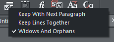
Earlier versions of Designer have support for Keep With Next, which helps prevent headings being left on their own at the bottom of a page, when the body text following them has flowed to the next page. Earlier versions also have Keep Lines Together, which is used to prevent a paragraph of text becoming split across two pages (the whole paragraph moves if it won’t entirely fit in the current page). v16 adds an additional option that prevents the first line of a paragraph being left behind on one page when the rest of the paragraph has flowed onto the next page (an orphan line). And similarly it prevents the last line of a paragraph flowing to the next page on its own (a widow line). Find the option on the Advanced text bar - it’s one of the Paragraph Options. All these options work the same way where text flows from one linked text area to another (in multi- column pages), as well as from page to page.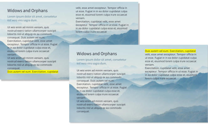
XARA
DESIGNER PRO X
V16 Release Notes
XARA
DESIGNER PRO X
V16 Release Notes
Page 5
An orphan (highlighted) joins its paragraph when Widows and Orphans is applied
OpenType Improvements
The Advanced Text Tool InfoBar has the following changes: • Ligature and Stylistic Set options separated into two separate buttons and menus • Addition of Text Capitalization button and menu • Addition of Contextual Alternates toggle button (under the Open Type Alternates button from March 2019). • Addition of Stylistic Alternates, Titling Alternates, and Swashes under the Open Type Alternates button (March 2019).Dynamic On-Canvas Preview
Now when you select some text and move your mouse pointer over the different options in the Ligatures, Stylistic Sets and Text Capitalization menus, your text will update dynamically to show you a preview of what the option will do. This makes it easier to see the effects the different options will have on your text, if you choose to apply them.Contextual Ligatures
Earlier versions of Designer recognize sequences of two or more characters that can be replaced by a single ligature glyph that is provided by the font for that particular character combination. For example with ligatures switched on the two character sequence could be replaced by the single ligature glyph . But OpenType also includes more complex substitution rules to determine which ligature glyphs should be used, where the substitution depends not only on the actual characters replaced but also on the context in which those characters appear. So the actual ligature used for a given character combination may vary depending on what characters precede and follow the combination that is replaced. The option to turn on Contextual Ligatures is an addition to the Ligatures menu in v16. In the following example, with Contextual Ligatures on the character pair “ft” appears using a different glyph, depending on the other characters around it.


Ligatures
Stylistic Sets
Text Caps
Open Type Alternates


XARA
DESIGNER PRO X
V16 Release Notes
XARA
DESIGNER PRO X
V16 Release Notes
Page 6
Contextual Alternates
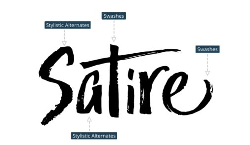
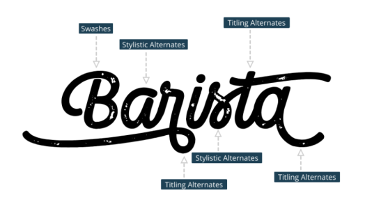
Some fonts provide alternative glyph designs for the same ligatures. Use the Contextual Alternates toggle button on the InfoBar to turn the alternates on and off for any character selection. In this example you can see the different glyphs used in the same word, one with Contextual Alternates off and one with it on. When you change this option, if you don’t see any differences in the selected text that’s because the font you are using doesn’t have any alternates for the characters you have selected.Titling & Stylistic Alternates and Swashes (March 2019)
Some fonts designers have included a range of advanced glyph options so that you can create the perfect typography for your mission. Designer now supports 3 extra Open Type features: Titling alternates, stylistic alternates and swashes. Now you can experiment with Titling Alternates, Stylistic Alternates and Swashes Titling Alternates When this option is turned on, default character glyphs from the font are replaced by alternative glyphs


XARA
DESIGNER PRO X
V16 Release Notes
XARA
DESIGNER PRO X
V16 Release Notes
Page 7
designed to look good at larger sizes. So they are generally intended for use in headings and titles, but in
fact you can use them anywhere. Not all fonts provide these alternates and not all characters in the font
may have them. Here is an example using the font Camper.
Stylistic Alternates (March 2019)
Turn this option on to see alternative glyphs that may be provided with a font for some characters, as an
alternative to the default glyphs. Experiment with these alternatives for different aesthetic or design
effects, where the font provides them. Here is an example using the font Trailmade.
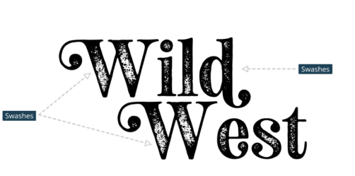
Swashes (March 2019)
Swashes are highly decorative or ornamental glyphs, often with elaborate flourishes. Here is an example
using the font Neoto Serif Rough.
XARA
DESIGNER PRO X
V16 Release Notes
XARA
DESIGNER PRO X
V16 Release Notes
Page 8
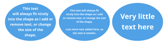
Auto-fitting Text
A powerful new option makes it easy to fit any text into any required shape or area. It automatically resizes the text to ‘best fit’ into the area or shape. You can try it yourself in our demo flyer, download it here. Some common uses: Instead of having to manually adjust the font size in order to fit the text into this shape, just turn on the new ‘Auto-fit to Container’ feature and type away. What you type will automatically be sized to fit. The option is part of the Vertical Align control which is on the Text InfoBar. The Vertical Align control With this option on, the font size of the text is automatically adjusted so that the text will just fit into the available space. Add more text and the font size reduces, so the text will still fit. Remove some text and the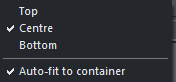


XARA
DESIGNER PRO X
V16 Release Notes
XARA
DESIGNER PRO X
V16 Release Notes
Page 9
font size grows so the text will still fill the container.
It works with simple text areas …
And also with text fitted into any shape …
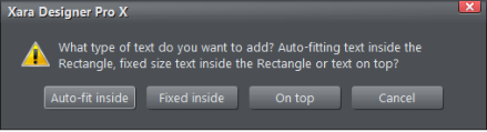
To place text inside a shape, such as these, select the shape and then in the Text Tool click on the shape.
You will see a new dialog which gives you multiple options:
If you have text already in a shape (or text area) you can turn on the Auto-fit feature by accessing
the option under the vertical align icon described above:
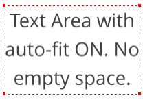
Relative Text Sizing
You can use mixed font sizes too, just as you would in a normal Text Area. As you add and remove text, the text scales to fit, while always preserving the relative difference between the font sizes in the text.
XARA
DESIGNER PRO X
V16 Release Notes
XARA
DESIGNER PRO X
V16 Release Notes
Page 10
Although the absolute point size is mostly meaningless (because the text is dynamically resized) the system
does retain the relative size differences of text within the text area being fitted. This is very powerful and
enables a mix of font sizes, as shown above. You can select any portion of text in the usual way, and then
adjust the point size, to see the change relative to the rest of the text in the area.
In the example above if we try to make the heading 28pt, it immediately changes to 24.19pt, but that’s
expected with auto-fit turned on.
Dynamic sizing also works with repelling. The text automatically scales to fit the available space, taking into
account the reduced space caused by the repel.
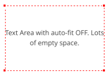
Shrink Text On Overflow (June 2019)
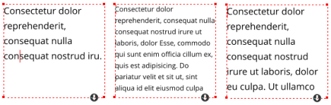
An additional option has been added for handling text that won’t fit in its text area. Shrink text on overflow is next to the Auto-fit to container option in the vertical text alignment menu. When this option is on for a text area, the text stays at its normal size as long as it will fit in the text area. But if more text is added so the text would overflow the text area, it gets scaled down so that it will still fit. So this option only affects text that won’t fit in the text area at its natural/set size. Remove some text again, or make the text area bigger, and the text returns to its natural size. As with auto-fit to container, any relative size differences in the text are maintained as the text is scaled down. In the following examples, the left text area has plenty of space, so text appears with the font size it was given. In the center example, more text has been added so that it would no longer fit in the text area, so the text has been scaled down to fit. In the right example, some text has been removed so it will again fit in the text area with its original font size.
XARA
DESIGNER PRO X
V16 Release Notes
XARA
DESIGNER PRO X
V16 Release Notes
Page 11
Text Area Overflow Menu (June 2019)
The button shown at the bottom of a text area when text won’t fit in the area is now always shown when
there is a caret or text selection in the area. And the menu shown when you click the button now includes
the new Auto-fit to container and Shrink text on overflow options. So this menu provides access to all the
methods of handling text overflowing the area.
Detaching Text Inside
If you have text inside a shape and want to detach it, so it’s now floating separately, there’s a new Detach option on the Text inside context menu. Right click on the text to access this.New Case Options
The Text Tool Advanced text bar now includes these new options: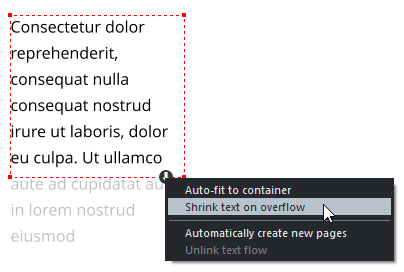
XARA
DESIGNER PRO X
V16 Release Notes
XARA
DESIGNER PRO X
V16 Release Notes
Page 12
The options in the top section of the menu are all text settings, (that is, a text attribute so they act like Bold
and Italic) so that subsequent editing maintains the case setting you’ve chosen. These settings also work
with text styles, just as all other text settings do, so for example you can define a heading style to always
appear in capitals by applying ALL CAPS and then updating the style definition.
As Typed
This is the default setting for all text, the case remains as whatever you typed.
ALL CAPS
Text is always all upper case, whether it was typed as upper or lower case.
all lower
Text is always all lower case, whether it was typed as upper or lower case.
Initial Caps
The first letter of each word is capitalized.
Small Caps
Characters that were typed as lower case are shown as small upper case characters. Characters that were
typed as upper case will appear as normal, so slightly larger (as you can see in the Small Caps heading
above).
Some OpenType fonts include special character glyphs for Small Caps and if the font you are using does,
Designer will use them, so you will see Small Caps text appear exactly as the font designer intended. If the
font you are using does not provide its own Small Caps character glyphs, Designer will use the font’s
ordinary upper case characters, but at a reduced size. Therefore you can safely use this option with any
font, whether or not the font has Small Caps support.
Toggle case

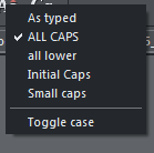
XARA
DESIGNER PRO X
V16 Release Notes
XARA
DESIGNER PRO X
V16 Release Notes
Page 13
This option is shown in a separate section of the menu because unlike the other options above it is not a
setting - it simply toggles the case of each letter in the selected text.
Improved Rule-off Sizing
Horizontal rule-offs embedded in text now automatically reduce in length to fit the available width, just as the text around them does. Insert rule-offs into text using Insert > Rule-off. So if for example the text in which the rule-off appears has a margin, or is repelled, the length of the rule- off reduces accordingly. Photos embedded in text can be made to behave the same way (scale or crop horizontally, to fit the available width), by turning on the Scale only in horizontal direction option in the Embedded graphic options dialog.Embedding & Anchoring with Repeating
Designer now allows text that is Repeating, such as header and footer text that appears on every page of a document, to include embedded graphics. Also objects can be anchored to repeating text.Smart Fields (June 2019)
Smart Fields are any commonly used text phrases that you may want to insert in multiple places in text. Each Smart Field has a name and a value, and when it’s inserted into text you see the value. For example you could have a Smart Field named CameraPrice which you define to have a value of $499. You can then insert that into your document(s) wherever you want to show the price. But at any time you can edit the definition of the Smart Field to change the price and it will be updated everywhere it appears in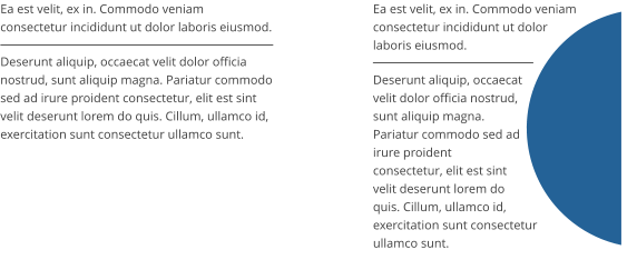
Rule-off extends the full width
of the column
Rule-off fits into the reduced
width caused by the repelling shape
XARA
DESIGNER PRO X
V16 Release Notes
XARA
DESIGNER PRO X
V16 Release Notes
Page 14
your document.
There are two types of Smart Field. Personal Smart Fields are stored on your device, so once you’ve set
them up you can easily insert them into any documents. Document Smart Fields are stored only in the
current document.
Smart Fields Dialog
You can open the Smart Fields dialog from Utilities menu or the Insert menu. By default it opens with the Personal Smart Fields selected - click the Document Smart Fields button to switch to viewing the Document Smart Fields. There is a default set of Personal Smart Fields the first time you use Designer. You can edit the values of each of these by clicking in the Value field. When you’ve done this once the values you entered are saved on your device and will be available for insertion into any document you edit on that device.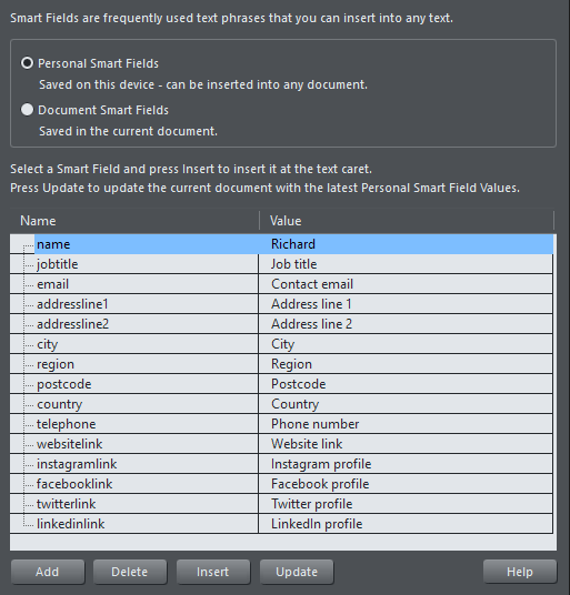
XARA
DESIGNER PRO X
V16 Release Notes
XARA
DESIGNER PRO X
V16 Release Notes
Page 15
Adding & Deleting Smart Fields
You can add as many additional Smart Fields as you like - just click the Add button, then choose a unique name for your new Smart Field and enter a value. If you select an existing Smart Field before clicking Add, the new field is added following the selected field. Otherwise it’s added at the bottom of the list. The order of the Personal Smart Fields is remembered too. To delete a Smart Field you no longer need, click on it to select it and then click the Delete button.Inserting & Editing in Text
To insert a Smart Field into your document, make sure you are in the Text Tool, place the text caret where you want to insert the Smart Field, then right click and choose Insert > Smart Fields… select the Field you want to insert, and click the Insert button. If you want to insert multiple Smart Fields you can keep the dialog open, move the text caret to a new position and then select and insert another field. You can select Smart Fields in text just as you select ordinary text, and apply text attributes to them in the usual way. You can’t place the text caret in the middle of a Smart Field - it behaves as a single object in the text, similar to how embedded objects work. If you want to edit the value of a Smart Field, you can right-click on it in the text and choose Edit Smart Field from the context menu. The Smart Fields dialog opens showing the Document Smart Fields and the target Smart Field is pre-selected, so you can edit its value and it will update wherever that field appears in the text of the current document.Update
The Update button in the Smart Fields dialog checks the current values of your Personal Smart Fields against those in the current document, and updates the fields in the document if they differ. So use this to update existing documents if you have changed your Personal Smart Fields since the document was edited.Links to SmartFields (Oct 2019)
SmartFields are useful for text that is used in multiple places, but they are also very handy for commonly used web links (URLs). For example you may frequently want to link to your main website link (website:link). Therefore we’ve added an additional option to the Link dialog, that allows you to select a SmartField as the target for a link. This update also adds support for pairs of SmartFields, where one field specifies the text to be shown in the document and the other specifies the link address that is to be applied to that text. For example whenever the SmartField website:text is inserted into text, it will automatically become linked to the address specified by the website:link SmartField. You can add your own SmartField pairs like this, simply use the same name (“website” in the example above) with :text appended for the display text SmartField name and :link appended for the corresponding link SmartField name.
XARA
DESIGNER PRO X
V16 Release Notes
XARA
DESIGNER PRO X
V16 Release Notes
Page 16
Paragraph Background Color (Oct 2019)
This new text feature is a great way of making your headings stand out. You can set the background color of a paragraph and that background fills the full width of the text column or text area. To apply a paragraph background color, place the text caret in the heading or paragraph, right click on the color you want to use on the color line and choose Set Paragraph Background. Or you can open the Color Editor and select the Local paragraph background color from the color list dropdown. Note that you can still set the background color on words or characters in the text as before, just by selecting the words/characters and choosing the Set Text Background option in the color menu instead, or by selecting Local text background in the Color Editor. So the Paragraph Background option always applies to the whole of the current paragraph, whereas Text background applies just to the selected words/characters.Other Text Improvements
• You can now select whole words at a time in the Text Tool, forward or back, by double-click dragging on text. Similarly triple-click dragging selects whole lines of text at a time. And quadruple-click dragging selects whole paragraphs at a time. (Oct 2019)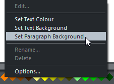


XARA
DESIGNER PRO X
V16 Release Notes
XARA
DESIGNER PRO X
V16 Release Notes
Page 17
Photo Improvements
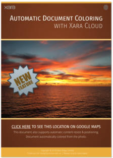
Color Palette From Photo
A technique many professional designers use to enhance the look of documents is to tie the colors used in design elements to the colors used within a photo of that document. In this way the whole document is given a more harmonious, attractive color scheme. Designer 16 includes a powerful new tool that will analyze a photo, identify the predominant colors in the image, and create a color palette of those colors with the names ‘Theme Color 1’ to ’Theme Color 5‘. By using these Theme Colors in your document, and linked shades of these colors, you can create a document that can automatically take on the colors of any photo in the document. Below is an example that shows how effective this can be. This page has been designed to use the standard Xara theme colors that work with the Palette from photo feature. Each of the 3 versions of the page has had the photo changed and then Palette from photo invoked to update the document’s colors to match those of the photo. In all other respects these 3 designs are identical. To use this feature, simply select the photo you want to use to set the document colors, then click the last icon on the end of the Photo Tool flyout bar. Designer instantly analyses the photo and chooses up to 5 of the most predominant, but independent colors (very similar shades of the same color are considered as a single color). It uses these to set the


XARA
DESIGNER PRO X
V16 Release Notes
XARA
DESIGNER PRO X
V16 Release Notes
Page 18
XARA
DESIGNER PRO X
V16 Release Notes
XARA
DESIGNER PRO X
V16 Release Notes
values of the named colors Theme Color 1 to Theme Color 5. If these colors are already in your document,
as they probably will be if you used a Xara template, they are updated. Otherwise they are added and you
will see them appear at the bottom left of your color bar.
The 5 theme colors for each of the 3 examples above - together with 4 lighter and darker linked shades.
Using Theme Colors
The color analysis is quite sophisticated. It’s based on a heuristic that determines the predominant colors based on their brightness, and coverage area. It automatically combines similar shades. For example, a blue sky typically contains many lighter and darker shades of the same blue hue. So this would be created as a single blue color. It also adjusts the brightness of Theme Color 1 and 2 (the two most predominant colors) so it always provides a good contrast against a white page background. This means you can always use ’Theme Color 1’ as a heading color on a white page, for example, and it will be readable. Or, alternatively you can place white text on Theme Color 1 or 2, perhaps on a colored rectangle of Theme Color 1 or 2, and that text will also always be readable. It’s always good design practice to limit the number of different colors (as it is to limit the number of different fonts and font sizes) within a document. But the use of shades of your predominant color is to be encouraged. To help make the use of lighter and darker shades, the program creates two linked paler, and two darker shades of each of the Theme Color 1 to 5 colors. You can see in the above examples the use of brighter and darker shades of Theme Color 1 and 2. When there are limited numbers of significant colors in the image, the program uses shades of gray for the higher Theme Colors.Text Color
Another common technique designers use is to link the main text color to the predominant theme color, although obviously this needs to be dark enough to provide contrast to be legible. Therefore the program also creates a named color called ‘Text’ that could be used for the body text of your document.Customizing
You can customize the named colors in the usual way. Right click on the color patch on the color line, and select Edit.


Page 19
XARA
DESIGNER PRO X
V16 Release Notes
XARA
DESIGNER PRO X
V16 Release Notes
Extracting Colors From Logos
This feature also works from any image including transparent PNGs so, for example, if you add a company logo graphic to your page that includes your brand colors, you can automatically set the Theme Colors to match those used in your company logo. Why not download our demo doc and give Color Palette From Photo a try.Panorama Maker
Xara Designer Pro includes a copy of MAGIX Panorama Studio, which is a separate application you can download and install after you have purchased and unlocked Designer Pro. See the download option in the Help menu. Additionally Xara Designer Pro, MAGIX Web Designer Premium and MAGIX Photo & Graphic Designer include a more limited built-in Panorama tool, available on the Photo Editing toolbarImprovements
• Improved mask tool • Improved graphics tool to insert graphics such as logos or icons • You can now align existing panoramas when importing • Improved support for HiDPI and 4K monitors • Updated RAW import • More than 200 new cameras were added to the camera database which contains now more than 2400 cameras. • Animated hotspots • Enhancements for interactive panoramas: o Map element to show an overview of the panoramas on a map o Gallery element to show a thumbnail overview of the panoramas of a virtual tour o Compass/Radar element to display the viewing directionImprovements (Oct 2019)
• Improved exposure correction. The adjustment of individual images as well as the global exposure correction have been improved. • Improved and optimized Render procedure. • The performance of the static blending is now about 10 to 20 percent faster and the adaptive blending (“Anti-ghost”) is about twice as fast as before. • A new method to interpolate missing image content fills gaps or undefined areas around the panorama with blurred content of the nearby image areas. • Studio only: New interpolation methods allow advanced users more sophisticated render settings. • Studio only: Improved preview in the single-row mode. • Studio only: Added 75 new cameras to the camera database which contains now more than 2480 cameras.
Page 20
XARA
DESIGNER PRO X
V16 Release Notes
XARA
DESIGNER PRO X
V16 Release Notes
Web Export Improvements
Fit To Width Websites (June 2019)
Make your website or web document scale to fit the width of the browser or device screen it’s being viewed on. If the viewing device is wider than the page, the page zooms / scales up so it just fits. If the viewing device is narrower than the page, the page content zooms / scales down so it will fit with no need for the dreaded horizontal scrollbars on desktop. You can specify a maximum width to avoid your content looking too inflated on very large screens. You can try it for yourself by adjusting the browser width on our demo site 1 (based on the Auberge theme) and demo site 2. This new option is set in the Utilities > Web Export Options dialog. It can be used with any type of document or website, except when either the Horizonal Supersite or Fit To Screen options are selected.Use with Variants
Variants are used to switch between different page layouts, allowing different layouts to be used for different device widths. The variant whose width most closely matches that of the device is selected
Page 21
XARA
DESIGNER PRO X
V16 Release Notes
XARA
DESIGNER PRO X
V16 Release Notes
automatically, as a visitor views your website or web document.
The new Fit To Width option should help you to reduce the number of variants required, because your
content will scale to fit the device it’s being viewed on. But since variants allow the page layout to be
changed too, they are still valuable and in some cases essential. For example just scaling down your
website / document may make text too small on a small device, if the text doesn’t occupy the full width of
the page.
However the good news is you can use both features, Variants and Fit To Width, together. The closest
matching variant will be selected automatically, as usual, depending on the user’s device width. But
additionally the content will be scaled to fit the device width exactly. This gives a smoother, more ‘fluid’
transition between one variant and the next.
SmartShapes
New Pie Chart SmartShapes
The charts section of the Online Content Catalog now includes pie charts. These offer a super-easy way to create a high-quality vector pie charts, with the program automatically calculating the correct percentages for each pie slice. Key features include: • You can adjust the pie segment values three ways: o By dragging directly on pie segment handles to adjust the % size of each slice. o By using a Data Input Form to the enter a simple column of numbers, with optional labels o By pasting CSV data into the input form, say from a spreadsheet. • You can display the values as a percentage or absolute value. • It automatically positions the labels around the pie, using a common text style. Edit one label style and they all change to match (although you can apply different styles to each label if you wish). • You can ‘pull out’ to highlight any one segment simply by clicking on it, as shown above.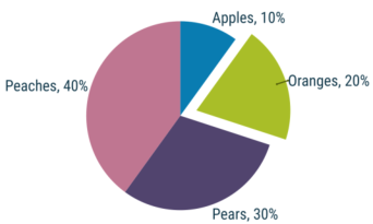
Page 22
XARA
DESIGNER PRO X
V16 Release Notes
XARA
DESIGNER PRO X
V16 Release Notes
•
The segment colors are based on the Theme Colors used in your document (Theme Color 1 to 5 and
then shades) so the pie chart will match your document color theme.
•
Or you can easily customize the color of any segment.
There are some ready-made Pie Charts available if you select the menu Insert > Charts.
As usual the handles on the SmartShape show a tooltip that tells you what each does.
To display the Data Input Form, click the green handle top left of the SmartShape. It will open up an input
area on the right side of the Pie Chart, like this:
Shows the Data Input Form area. You can show / hide this using the green handle top left.
Using the Text Tool click in the lower data input area and type label, value pairs as required. As you edit this
the pie chart is updated live. Each time you add a new entry on a new line, a new pie segment is created.
You can also drag the handles on the edge of the pie slices and the corresponding data values change in
proportion. The % indicator on the top right changes the values displayed on the pie from absolute values
to percentage values.
As with all the SmartShapes, hover over the adjustment handles to see a function description.
Pasting CSV Data
You can paste properly formatted CSV (Comma-Separate Values) data in the form area. It has to be formatted like this label, value <newline> up to a maximum of 15 entries. This supports data copied from Excel and Google spreadsheets. Just make sure you paste the data as ‘unformatted text’. A few tips that can be useful ensuring the data is accepted. • If you want to use spaces or commas in the label, surround the label text in single or double quotes • You can use either a comma or a tab as a separator • The label is optional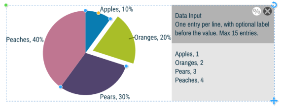
Page 23
XARA
DESIGNER PRO X
V16 Release Notes
XARA
DESIGNER PRO X
V16 Release Notes
So if you have a spreadsheet in the form:
29 May 2018
$234.50
1 Jun 2018
$1230.00
6 Jun 2018
$678.00
23 Jun 2018
$1,234.001
Sep 2018
$1,256.00
This would not work when pasted because the labels contains values, the values are shown with dollar
signs, and formatted with commas, as is common for monetary values. However a bit of tweaking will make
this data display correctly,
‘29 May 2018’, 234.50
‘1 Jun 2018’, 1230.00
‘6 Jun 2018’, 678.00
‘23 Jun 2018’, 1234.00
‘1 Sep 2018’, 1256.00
Which will display this. It has the 4th segment highlighted.
Coloring the Pie Chart
The pie segments use Theme Color 1 to 5 for the first five segments, and then lighter and darker shades of these colors for the next ten segments. If your document contains more than five slices, it will use lighter and darker shades of Theme Color 1 to 5 for the next ten segments. If you do not have any Theme Color defined, the slice will appear black and you will have to manually color the segment. To color any segment, first click it (this will pull out the selected segment), and now click a color on the Color Line.Editing Label Text
If you change the whole text of any label e.g. the color, font or size, they all change to reflect this. To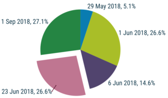
Page 24
XARA
DESIGNER PRO X
V16 Release Notes
XARA
DESIGNER PRO X
V16 Release Notes
change an individual label, give it an alternative Text Style. You’ll notice labels on the left side are left
aligned.
If you want to change the relative size of the pie to the text, use the orange Radius handle to resize the pie.
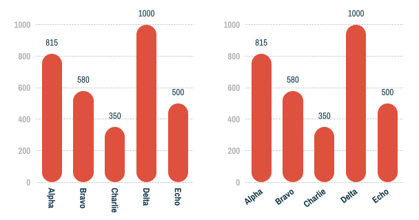
Improved Bar & Column Charts (Oct 2019)
Column and Bar charts now have the following improvements. You should see the additional new handles on your existing charts.Gridlines
You can now choose to show labeled gridlines on your charts.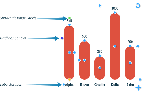
Page 25
XARA
DESIGNER PRO X
V16 Release Notes
XARA
DESIGNER PRO X
V16 Release Notes
Drag the Gridlines Control handle up or down to change the number of gridlines shown on the chart. Drag
up to show more gridlines, down to show less gridlines or to turn them off completely. Bar charts have a
similar control on the X axis, drag right for more gridlines, left for less gridelines or to turn off.
Show/Hide Value Labels
Now that charts can have visible grid-lines and axis labels, you may not always want to show values on each bar or column. So you can turn them on when you want to edit the values and turn them off again when done, if you don’t want them displayed on your completed chart. Click to toggle values on or off.Label Rotation
On column charts the label rotation handle allows you to change how the X axis value labels are displayed. Drag the handle to see a variety of different rotation and positioning options. By rotating so the labels are vertical, or at an angle, it’s easier to fit in longer labels without any ugly line wrapping.Line Charts (Oct 2019)
Page 26
XARA
DESIGNER PRO X
V16 Release Notes
XARA
DESIGNER PRO X
V16 Release Notes
Line charts are new in the October 2019 release - find them alongside the other types of charts in the
Online Content Catalog (Insert > Charts …). The control handles are the same as on column and bar charts
and work broadly in the same way. It’s even more likely you’ll want to turn off the value labels on Line
Charts, with gridlines turned on. See the descriptions of those new handles in the Improved Bar & Column
Charts section above.
Improved arrows
One of the most popular graphic elements is the arrow. Xara Designer includes perhaps the most flexible, yet simple-to-use arrow tool - the Arrow SmartShape. And we’ve made a number of improvements in this release. The great thing about the Arrow SmartShape (and this applies to all SmartShapes) is that there’s no complex arrow tool to learn - the arrow is controlled by dragging a few handles on the shape. So creating and customizing an arrow is an interactive, visual experience. We provide a library of pre-set designs, which can be customized as required. Use the menu Insert > Shape > Arrows… to insert an arrow.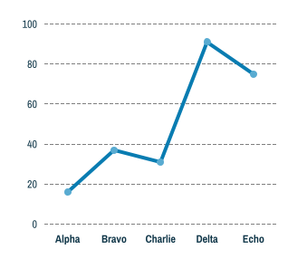
Page 27
XARA
DESIGNER PRO X
V16 Release Notes
XARA
DESIGNER PRO X
V16 Release Notes
Some examples:
Arrow Improvements
•
The arrow shaft is a line, rather than a filled shape. This means it’s now possible to apply any line
effects such as dash or line profile. You can use the standard line End Cap control to control whether
the dash lines have rounded caps or square caps.
•
Hold Shift to resize or rotate around center. E.G. to make a line wider, but remain centered where it
is, use Shift and drag outwards.
•
It snaps to 45° angles by default. Use Ctrl to un-snap.
•
Shift on the orange handle to produce a balanced (symmetrical) curve.
•
It shows the angle now, from either end. Interactive, live as you drag. And now also length
(when straight line only) is shown in the current page units.
•
Unlike legacy (non SmartShape) arrows the line length includes the space for head / tail
•
New Flat head design. Use the Line style Round Cap control if you want this rounded.
•
Accepts and shows the correct line width via the standard line width control.
•
Updated and improved head / tail handle (easier to click through styles, better position).
•
Fixed bugs with transformed arrows (behaves better when changing page size or when transformed
as part of a group).
There’s also a new flat line end style, as shown in the first example above. Change the style of each end of
the arrow by dragging on the green style handles. Existing arrows in your document will instantly update to
to the new versions as soon as you start editing them.
Note that the arrows selection in the Online Content Catalog includes some different types of arrows where
the head and shaft are formed from a single shape e.g. these


Drag to adjust the size of
the whole arrow.


Drag to adjust the line width


Drag to curve the line


You can adjust the tail size
independently


Click the green handles either
end to adjust the head or tail
style. Or drag to scroll through
the options.
Page 28
XARA
DESIGNER PRO X
V16 Release Notes
XARA
DESIGNER PRO X
V16 Release Notes
These arrows have not changed as they work differently and are of an entirely different design.
Labeled Lines (March 2019)
These new designs are useful as headings, titles, dividers and for labeling in diagrams. If you use a number as the label they can even be used as rulers. See some examples below.
TODAY’S MENU

TODAY’S MENU

the
SINGULARITY

18th October

TODAY’S MENU


TODAY’S MENU


6.94cm

Brushed Line

Page 29
XARA
DESIGNER PRO X
V16 Release Notes
XARA
DESIGNER PRO X
V16 Release Notes
You can find these in the Online Content Catalog and in the Insert menu - Insert > Shape > More Lines &
Arrows. As with all SmartShapes, hold the mouse pointer over each handle to see a tooltip telling you what
the handle does if it’s clicked or dragged.
Notes
•
When you set the label text to a number followed by a dimension unit, the line length will
automatically change to match the length specified. So for example if the label is set to 10cm, as soon
as you click away from the label text, the line will update to be 10cm long. You can enter other units
such as inches, px (pixels), mm, etc. If you enter a number without any indication of units, the units
of the current document are assumed (as set in Utilities > Options > Units).
•
When the labeled line is selected, the line width control on the top bar shows you the current width
of the line. You can change the line width using that control, or drag the line width handle on the line.
Or with the mouse pointer over the line, hold down Ctrl and Shift and use your mouse wheel to
adjust the line width.
•
You can also change the line style, by selecting the labeled line and choosing from styles in the Line
Gallery. Or apply a brush stroke or line profile using the Freehand Tool, as shown in the last example
above.
•
Drag the end style handle on each end of the line to cycle through a variety of different end styles.
•
As you make the label text longer or shorter, the lines adjust their size to fit, without changing the
width of the overall design.
•
Drag the end handles to move the ends and adjust the length of the line, just as you do with arrows.
Table Improvements
Tables are powerful but usually very complex structures. Table editing usually has complex user-interface controls, dialogs, menus and dozens of options (See Word). We have tried to create a ‘visual table editing’ experience, where we avoid dialogs and numeric controls as much as possible. Instead you use drag and drop to arrange your table, to add or remove rows and column, to adjust the width or height of rows and columns or the whole table, to re-arrange rows, to adjusting the spacing, cell padding - in a fluid, direct feedback manner.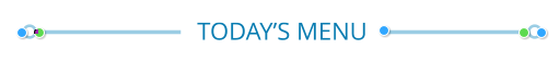
Blue handles at either end adjust arrow position:
Hold Shift key to resize around the center
Hold Ctrl to prevent snapping
Green handles at either end: drag to select head & tail styles
Shift + drag to change selected only
Drag to adjust line thickness


Page 30
XARA
DESIGNER PRO X
V16 Release Notes
XARA
DESIGNER PRO X
V16 Release Notes
The Table SmartShape has undergone significant improvements with this release. In summary:
•
Improved usability - better handles, more obvious controls, handle tooltips.
o
New handles on right and lower edges of the table, to add / remove rows or columns or to
stretch resize
o
Resizing a column or row now pushes the remainder of the table along. Hold Shift to just resize
the column (or row) within the table.
•
Improved, easier, cell selection and display. It shows a blue line around the selected cells.
•
You can select ranges of cells using standard Ctrl and Shift keys.
•
Easier color application to the selection.
•
Merge cells, and Un-merge to restore back to grid.
•
Drag a row or column away (left or up) to delete a row.
•
Border control: The ability to draw individual edge lines, top, right, bottom and left side of the cell (or
selection of cells).
•
Inner and Outer padding control. Inner padding allows you to space all cells vertically or horizontally
apart.
Populating tables with data
Paste tab delimited text data to quickly populate a table - so in Excel for example: • Select and copy cells • In Designer place the text cursor in the top left cell of the destination table - make sure the cell is empty. • Paste using the ‘Unformatted Text’ option.Cell, row and column selection
You can select a cell by just clicking on it. A blue outline shows the selected cell or range of cells. You can use Shift and Ctrl keys when selecting cells to extend the range in the usual manner. To select a row or column click the orange handle at the top or left end of the column or row. Once you have a selection you can apply attributes such as colors (background, outline or text) or text attributes such as font, size etc. You can use the new ‘Auto-fit to container’ feature in table cells, so the text will scale as you adjust the size of the cell via the row or column adjustment.Coloring a selection
You can set the colors of the cell background, cell outlines or text in three ways: 1. Right click on a color on the color line and select to apply the fill color, or line color (use the standard Line Width control to set the line width around the cell). 2. Or, just click on a color patch on the color line. This will display the ‘group color picker’ which displays all the elements in the selection and asks you to select which you color you want to replace.
Page 31
XARA
DESIGNER PRO X
V16 Release Notes
XARA
DESIGNER PRO X
V16 Release Notes
3.
Or, you can bring up the color editor, (Ctrl+E) and use the top drop-down menu to select which color
parts of the selection (background, lines, or text) you want to edit.
Border Control and Merge
When you select a cell, range of cells, row or column an extra green handle appears at the top left of the selection. Clicking this displays the Border Control UI as a small pop-up: The first 4 controls represent the four edges of the selected cells. You can click to highlight any, or all, of them. In the above case the right edge is highlighted. If you now adjust a line value, say to select a line width of 2pt, it will apply the line to the right edge of the selected cells. Note: only while the Border Control UI is visible does applying line values affect the selected edges. if you close the border control, then applying a line width, or line colour, it will apply to all 4 edges of the selection.Merging and Un-merging Cells
A common feature of spreadsheets is the ability to merge adjacent cells into a single larger cell. For example you might want a heading to span across two or more columns. To do this select two or more adjacent cells, bring up the Border Control UI with the green handle, as above, and click the Merge Cell icon. Any merged cell can be restored back to its original un-merged state, by clicking the same control again.To Duplicate a Row or Column
There’s no direct way to copy or paste a whole row or column at present (future updates will provide this ability). In the meantime there is a work-around. Dragging the right or bottom edge orange handle duplicates the last row or column. So to duplicate any required row or column, just drag it to the end of the row or column, (with the row or column select handle) and then extend the table, and drag the now duplicated row or column to the desired position.To Delete a Row or Column
Drag the row or column orange select handle outwards, away from the table. At a certain distance a red cross will appear, if you now let go, the row or column will be deleted.Improvements (March 2019)
• Can now apply style changes to a selection inside a table. • All text and All border options added to the replace color list when changing multiple colors. Plus other improvements to the color editor when used with tables. • Shift + drag on table width/height handles stretches the table around its center. • Improved border positioning and border formatting. • Now supports repositioning of row/columns that have merged cells.
Page 32
XARA
DESIGNER PRO X
V16 Release Notes
XARA
DESIGNER PRO X
V16 Release Notes
•
Performance improvements.
New Text & Photo Panels (March 2019)
The Text Panels and Photo Panels categories in the Online Content Catalog have been expanded with more customizable designs. Insert > Panels > More Text Panels Insert > Panels > More Photo Panels Most of the new panels are resizable, usually in width and height, so you can easily adjust them to fit any space, whether short and fat or tall and thin. Drag the left or right handles to change the width and the top or bottom handles to change the height. All text can be edited and styled using the Text Tool, the same as with ordinary text. To replace a photo image, go into the Photo Tool, click on the photo to select it inside the panel, then right-click and choose the Replace Photo option in the context menu. Or you can drag a photo from Windows Explorer or from the Bitmap Gallery and drop it directly onto the photo you want to replace.

SOME TEXT
THAT CAN
GROW

Irure dolor id. Excepteur sint cupidatat sed
officia, aliquip nisi lorem ipsum pariatur
eiusmod deserunt dolore, velit occaecat et
duis. Nisi excepteur, dolore adipisicing. Eu
veniam commodo est ex ea quis sint
tempor lorem elit amet deserunt dolor
fugiat. Dolore occaecat consequat, eiusmod
commodo ex exercitation, enim officia
laboris sit ex sunt ullamco mollit.

TITLE


FREE
Photo panel

Officia tempor consequat officia sit
consequat in amet nostrud fugiat
adipisicing occaecat non labore.


% SUPER SALE %
Ut wisi enim ad minim veniam, quis nostrud
exerci tation ullamcorper.


GET INSPIRED
WITH OUR
SMARTSHAPES


Ribbon
Panel
Page 33
XARA
DESIGNER PRO X
V16 Release Notes
XARA
DESIGNER PRO X
V16 Release Notes
Many of the panels will allow you to change the width or style of lines or outlines included in the panel. For
example the Ribbon Panel shown above allows you to change the width or style of the dashed circle inside
the panel. Just select the whole panel and then use the line width control to change the line width, or the
Line Gallery to change the line style, corner style, or end cap.
New Photo Frames (March 2019)
See Insert > Image > Photo Frame… for a new selection of attractive designs for presenting photos. As with all photos, to replace the images with your own, just go into the Photo Tool , click on the photo to select it and then right-click and choose Replace Photo from the context menu.New Simple SmartShapes (March 2019)
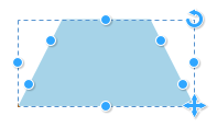
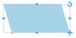
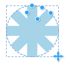
Some new simple shapes have been added, some of which are highly customizable. All new and existing simple shapes have been updated to now show dimensions when dragging (in document units). And all shapes now support Shift+drag to resize around the center of the shape. All these shapes can be found under Insert > Shape > More shapes … Geometric shapes are popular building blocks in many designs. The new SmartShapes add to your creative options


Page 34
XARA
DESIGNER PRO X
V16 Release Notes
XARA
DESIGNER PRO X
V16 Release Notes
Wheel
Parallelogram
Trapezoid
Pointy Shape
The following examples are all made using this very flexible SmartShape.


Page 35
XARA
DESIGNER PRO X
V16 Release Notes
XARA
DESIGNER PRO X
V16 Release Notes
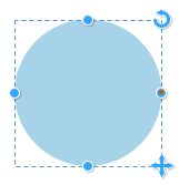
Square & Circle
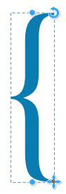
Note that unlike the existing ellipse and rectangle shapes, these cannot stretch, they always remain square. So they are useful when you have graphics that you do not want distorted by page resize or group resize.Braces
Use the top and bottom handles to change the height of these brace shapes without distorting them.


Page 36
XARA
DESIGNER PRO X
V16 Release Notes
XARA
DESIGNER PRO X
V16 Release Notes
Updated Text Panels (March 2019)
Text Panels are now compatible with the Vertical alignment and Auto-fit to container text options (see the Text Tool InfoBar). These text options were not previously available for text panels.
Center Aligned Text
Panel
Text Panel set to auto-
fit, so the text
automatically scales to
fit exactly in the panel
Page 37
XARA
DESIGNER PRO X
V16 Release Notes
XARA
DESIGNER PRO X
V16 Release Notes
New Content
Note: The full template set is only available in the Plus version. • 3 new Cards in Print > Cards & Invites (Birthday Invitation, Newborn Card & Wedding Invitation • 4 new Pie Charts in Components > Print & Web Components > Charts (Pie Chart 1 – 4) • 2 new Smart Tables in Components > Print & Web Components > Tables (11 and 12) • 6 new Arrow Designs in Components > Print & Web Components > Arrows (Smart Arrow 1 – 6) • 35 Photo Panels in Components > Image Resources > Photo Panels (March 2019) • 39 Photo Frames in Components > Image Resources > Photo Frames (March 2019) • 18 Text Panels in Components > Print & Web Components > Text Panels (March 2019) • 8 Labeled Line Shapes in Components > Print & Web Components > Lines & Arrows (March 2019) • Over 30 Shapes (incl Braces, Wheels, Trapezoid, Parallelogram, Wheels & more) Components > Print & Web Components > Shapes (March 2019) • 2 Photo Frames and 5 Smart Photo Frames (you can customize the shape) in Components > Image Resources > Photo Frames (June 2019) • 9 Photo Panels in Components > Image Resources > Photo Panels (June 2019) • 7 Text Panels in Components > Print & Web Components > Text Panels (June 2019) • 6 Labeled Line Shapes in Components > Print & Web Components > Lines & Arrows (June 2019) • 4 Line Charts in Components > Print & Web Components > Charts (Oct 2019) • 5 E-book templates in a new E-books category (Oct 2019) • 4 Invitation Cards and 4 E-Cards in Print > Cards & Invitations (Oct 2019) • 3 Facebook “Happy Holiday” templates in Social Media (Oct 2019) • 3 Instagram “Happy Holiday” templates i Social Media (Oct 2019)Import / Export
PDF Import
• Improved recognition of bold, Italic & underlined text (due to improved character recognition). • More accurate handling of line spacing, reducing the chances of overlapping text. • Improved object recognition: more vector elements and improved color import. • Better compatibility with Word-created PDFs. • Improved support for OpenType font features and ligature import. • Text paragraph reconstruction improved (fewer inserted newline characters at the end of lines to achieve the correct line break positions). • Better matching of fonts used in the PDF to locally installed fonts, improving editability. • Bug-fixes & improvements (June 2019 & Oct 2019)PDF Export
• Improved support for non-Unicode fonts.
Page 38
XARA
DESIGNER PRO X
V16 Release Notes
XARA
DESIGNER PRO X
V16 Release Notes
•
Optimizations: faster export and smaller file sizes.
•
Bug-fixes & improvements (June 2019)
•
GRACoL2006_Coated1v2 profile add to profile list (Oct 2019)
•
New PDF/X option added to export grayscale text to K plate only (Oct 2019)
PDF/X Auto-bleed (Oct 2019)
A bleed margin is typically used with documents that are to be printed and cropped by a commercial printing company. Where an object extends right up to the edge of the page, if there are any small errors in the printing or cropping of the page, an unsightly white edge can result along the edge of the page, where the cropping didn’t quite align to the edge of the object. To prevent this happening, objects touching the edge of the page can be extended by the user, beyond the edge of the page and into a bleed margin around the page. So then even if the cropping is not accurate, there will be no gaps at the page edges. However until now, users had to do this extending of objects into the bleed margin manually. This requires the user to understand why this is necessary and to remember to do it on all objects that touch the page edge. Xara’s auto-bleed now makes this unnecessary. When exporting documents to PDF/X with a bleed margin active, the margin is automatically filled by replicating the edge pixels all around the page edge. This means it’s no longer necessary to manually extend objects beyond the page edges, they can be snapped to the page edge. There are no new user options for this feature - just make sure your document has an active bleed margin set (File > Page Options) and choose the Commercial Printing (PDF/X) option when exporting a PDF (File > Export PDF).Word Import
• Auto-grow text boxes are imported as Xara Text panels. • Support for embedded objects in headers/footers. • Bug-fixes (Oct 2019)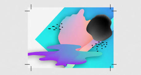
Page 39
XARA
DESIGNER PRO X
V16 Release Notes
XARA
DESIGNER PRO X
V16 Release Notes
Word Export
• Export of tables as Word tables (excludes embedded tables which are currently exported as images). • Bug fixes.PowerPoint Import
• Import of tables as Xara tables. • Improved handling of background objects imported to the Page Background layer. • Exclusion of redundant invisible lines and shapes. • Bug-fixes & improvements (March 2019 & Oct 2019)PowerPoint Export (NEW)
Presentations can now be exported as PowerPoint files (.pptx). Used font subsets are embedded in the exported document so that it can be viewed on systems that don’t have the fonts installed.Web/HTML Group Export (March 2019)
When exporting for the web (HTML) each object in a group can now be exported as a separate object, instead of the whole group being exported as a single image (the default). This for example means that text in groups will remain as text in the published web page. You can change this setting for each group in Utilities > Web Properties > Image tab. Refer to the program help for more info.SVG Import (Oct 2019)
• Added support for embedded gzipped SVG images • Support for embedded fonts (WOFF and TTF)SVG Export
Export of Selection (June 2019)
You can now export just the current selected object(s) to SVG, instead of only the full page. So, for example, you can now easily export individual graphics for use in other applications that will import SVG. This new option is available on the settings dialog when you export an SVG file using File > Export.Other improvements (Oct 2019)
• Circles, ellipses and rectangles now exported as native SVG objects instead of paths.Other Improvements
Cookie Consent Guide (March 2019)
A new guide that takes the pain out of adding a cookie consent banner to your website, with full control over text, position, layout, color, ‘learn more’ link and compliance model. You can find the guide here.
Page 40
XARA
DESIGNER PRO X
V16 Release Notes
XARA
DESIGNER PRO X
V16 Release Notes
Rapid Line Width Adjustment (March 2019)
Hold the mouse pointer over the edge of a shape, hold down Ctrl and Shift, and you can use your mouse wheel to rapidly adjust the outline width. This also works on lines to adjust the line width. This works whether or not the line/shape is selected.Color Themes and Text Styles for Imported Docs (Oct 2019)
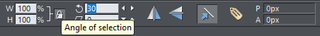
New in Options > General: select 'improve editability of imported docs' and Designer Pro will auto-create color themes and text styles to match commonly used colors and styles in your imported Word, Powerpoint and PDF docs.Rotation Angles (Oct 2019)
Designer has always shown an Angle of selection field on the Selector Tool InfoBar, which is used to rotate the selected object(s) by a specific angle. However, until now Designer has not recorded an object’s angle of rotation, so the angle shown immediately reverted to 0 after a rotation had been performed. Now when objects are rotated, the angle is permanently recorded and the InfoBar will show the current angle of the selected object(s). Angle values that you enter are absolute, not relative, so for example if the current selected object has an angle of 30 degrees and you change it to 45 degrees, the object’s rotation will become 45 degrees. If instead you want to apply a relative angle of 30 degrees (so the angle becomes 75 degrees), type a # character before the angle value. So typing #30 will add 30 degrees to the current angle, or #-30 will subtract 30 degrees. Points to note: • When several objects that all have the same angle are selected, the angle field will show that common angle. Typing a new angle will rotate the entire selection around the center of the selection. • When several objects are selected that have different angles, the angle field will show Many. Typing an angle value into the field in this case will rotate all the objects around their individual centers. • Groups have their own angles that are independent from the objects within them. When a selection of objects that have all the same angle are grouped, the new group will be given that same angle.