

Page 1
Last updated 8th October 2018
June 2018 Content Update
2
May 2018 Updates
2
Text inside shapes
2
Padding Margin
3
Selecting the containing object
4
Creating text filled shapes
4
Content Catalog Text Inside Designs
5
Tables
5
Table Handle Summary
6
Adding rows & columns
6
Deleting rows and columns
6
Table cells
6
Selecting inside tables to set background
colors
6
Outlines
7
Resizable Photo Grids
7
More Resizable Photo and Text Panels
8
Other New Content
8
Other improvements
8
December 2017 updates
8
Auto-fit
8
Text Improvements
9
List Styles
9
Anchored objects and text flow
10
Embedded object nesting
10
Text Panel Alignment options
10
New Content
11
Other Improvements
11
XARA
DESIGNER PRO X
Release Notes

Scroll through this document to see a description of all the great new features & content released in v15.
If you have an active subscription to Xara Designer Pro+ (available standalone or included in Xara Cloud Pro+, our
great value bundle of Xara Cloud and Designer Pro+) purchased from Xara, then these updates are free. If you are
an owner of an older version purchased from Magix, then check out our current offers on upgrades.
You can see details on later updates in v16 here.
June 2018 Content Update
A bonus content update! (Note: The full template set is only available in the Plus version). • 2 single page websites (Wellness and Software) • 3 Business Web Themes (Superfood Store, Law Firm and Yoga Trainer) • 3 Presentations (Energy Drink, Food Delivery, Nature) • 3 flyers in Print > Newsletters (Restaurant, Security, Sport) • New Social Media graphics ( Company, Food Delivery, Security) • 4 new Tables, in Print & Web Components > Tables • A selection of new Text Panels, also in Print & Web Components - 21 Smart Layouts (more complex and interesting Text Panel SmartShapes), 5 Text in Shapes, 1 Smart Object, 1 Text in SmartShape The latest content update includes some new and contemporary website designsMay 2018 Updates
Text inside shapes
You can now place text inside shapes, so that it flows within the shape’s outline. In fact you can add text to any type of object, even groups, as long as there is not already any text in the object. Simply select the object, then go into the Text Tool and click on the object. A text area is created for you on top of the object and you can enter your text and it will flow within the object’s outline.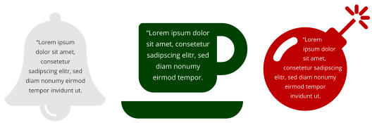

Page 2

Alternatively you can right-click on an object and select Add Text Inside from the context menu.
You can select, edit and format the text just as you would any other text and it will always format within the
outline of its containing object.
If the text won’t fit in the available space within the outline, it will overflow out of the bottom of the text
area, as with a normal text area.
In this case you need to take some action so the text will fit. You could reduce the font size or line spacing
of the text, make the container larger so it will fit more text, or reduce the padding margin (see below).
Padding Margin
The padding margin is the space between the shape outline and the text. Normally you will want at least a small margin as text flowing right up to the edge of a shape with no margin rarely looks good. You can change the margin in two ways. The easiest is to go into the Text Tool and drag on one of the small red arrows in the corners of the text area. As you drag, the text reformats inside the margin. The distance between the arrows and the corners of the red dotted box mirrors the same margin value, as an additional visual cue. Alternatively you can set the padding margin by right-clicking on the text area and choosing Text inside >
Page 3
Page 4
Properties…, which allows you to enter a value.
Selecting the containing object
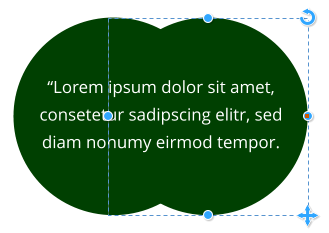
When you click on the object with text inside, you select the text area. The object within which the text flows (most commonly just a shape) is a child of that text area, so it behaves similar to a group. So if you move, copy, delete or resize the text area in the Selector Tool, the whole combined object is moved, copied, deleted or resized. If you want to select and edit the shape that contains the text, you can use Ctrl+click ,or right-click, Text inside > Select …. With the shape selected you can resize or edit it and then the text will re-flow within the new outline. A Group of 2 circles with text inside and one circle selected To make a copy of the shape without the text, select the shape, then copy and paste. To make a copy of the text without the shape, select all the text in the Text Tool, then copy and paste.Creating text filled shapes
If you want to create a text shape then all you need to do is to right-click the object and select Text inside > Select shape. Now switch into the Transparency tool and increase the transparency to 100%
Page 5
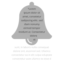
Content Catalog Text Inside Designs
The Content Catalog now includes some text panel designs that make use of this new feature of text inside shapes. See the Components > Print & Web Components > Text Panels folder (Insert > Shapes > More Text Panels …).Tables
Designer now includes tables. The new version supports basic table insertion and editing, including adding and removing rows/columns, resizing rows & columns, various table formatting options and automatic formatting of the table to fit contents. It has limited support for selecting and editing complete rows and columns - this aspect of table editing will be improved in a future update. Find tables in the Insert menu and also in the Online Content Catalog under Components > Print & Web Components > Tables, where you will find a selection of attractive table designs.
Page 6
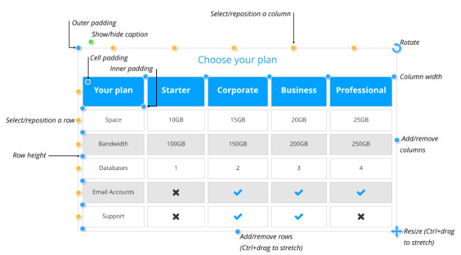
Table Handle Summary
Hover over the adjustment handles to see what they do. They are... Padding Drag to adjust the Outer padding, the Inner padding and the Cell padding. Select/Reposition Click to select columns and rows - drag to reposition them. Add/Remove Drag to add or remove columns or rows. Ctrl + Drag to stretch out the whole table. Show/Hide caption Click to show or hide the table caption title - edit using the Text Tool. Column width Drag to adjust column widths. Row height Drag to adjust the height of the rows. Resize Drag to scale the whole table. Ctrl + Drag to change the width and height of the table, without changing the size of the table contents. Adding rows & columns When you add a row , the last row of the table is duplicated to create the new row. If the table has different background colors for alternate rows, that formatting is maintained as you add more rows. Adding columns works similarly.Deleting rows and columns
Currently rows and columns can only be deleted by dragging the add/remove handles, which will delete only the last rows/columns. So if you want to delete any other row/column, first drag the select/reposition handle for that row/column, to make it last, then remove it by dragging the add/remove handle.Table cells
Each table cell has a text column and a background shape, which determines the background color of the cell. Use the Text Tool to edit and format text within the cell, just as you would edit any other text. You can also place any other type of object in a table cell by inserting it embedded in the text. To do this select and copy the object you want to insert to the clipboard, place the text caret in the cell and paste (Ctrl+V).Selecting inside tables to set background colors
The table as a whole has a background color and that determines the default color of each table cell. But each cell can have its own background color and you can set the color of a whole row or column of cells. If the table is not already selected, the first click on the table will select the whole table (you see all the table handles appear). Click on a color to change or replace any of the colors used in the table. With the table selected, clicking on a table cell will select that table cell’s background shape (the status line will show “1 shape inside”). Then you can set the color of that cell, or click ‘no color’ on the color line to reset it, so it will reveal the table’s background color.
Page 7
You can also change the color of all cells in a row or column by selecting the whole row/column. With the
whole table selected, click on the row or column’s select/reposition handle. That selects all the background
shapes in the row or column. You can then set or reset the background color of all the selected cells.
Outlines
With the whole table selected, the line width control on the top bar shows the width of the cell outlines for the whole table. You can change the outline width using that control, or remove the visible outlines by selecting ‘None’. You can also change the outline on a specific cell by selecting that cell and using the same line width control. And similarly on a whole row or column of cells, by selecting the row column. To set the color of the outline, right-click on the color line and choose Set line color.Resizable Photo Grids
The “Static” photo grid designs of earlier releases have now been updated to be resizable. See Components > Image Resources > Photo Grids in the Content Catalog. These are initially set to sizes that are commonly useful, such as square, 16:9, 4:3, etc., but once you’ve added them to your document you can change the width and height to make them any size and aspect ratio you like, from wide and short to tall and slim. Resizable Photo Grid Just drag on the side, top and bottom handles to resize. The photos are scaled, cropped or uncropped as you do this. Once you have the grid at the dimensions you want, you may need to adjust the scale and positioning of each image, to fit nicely in its new shaped frame. Go into the Photo Tool and click on each image to select, then use the adjustment handles on the photo to rotate/scale inside, or move the image in
Page 8
its frame.
Note you can’t change the number of photos in these designs, or the layout, they are fixed designs. Use the
grids in the Smart Photo Grids folder if you want grids that automatically adapt to any number of photos
with any shapes.
More Resizable Photo and Text Panels
A selection of new resizable text panels and photo text panels, of various designs, have been added to the Online Content Catalog. See the new designs in these folders: Components > Print & Web Components > Text Panels Components > Image Resources > Photo PanelsOther New Content
A bonus content update! (Note: The full template set is only available in the Plus version). • Created using the new features: Table SmartShapes (in Components > Print & Web Components > Tables) and text panels with text flowing inside (in Components > Print & Web Components > Text Panels) • 3 new web stories (Food Delivery, Coffee Shop and Water Aid in Websites > Single Page Websites) • 2 new presentations (Campsite and Consulting) • A selection of new social media graphics for Facebook, Twitter, LinkedIn and Instagram • Some new Flyer templates (in Print > Newsletters)Other improvements
• PDF import improvements • PDF export improvements • When stretching text or images using the Selector Tool top, bottom and side handles, Designer will try to avoid distorting them, because usually distorted text and images look poor. However you can now override this and stretch or squash the image/text by holding down the Alt key as you drag (alternatively you can revert to the old stretching behaviour by disabling Smart Transform by right clicking on the lock aspect ratio icon).December 2017 updates
Auto-fit
Designer Pro X has a new ‘auto-fit’ capability that enables you to create flexible documents that adapt to
Page 9
almost any size change you or your customer might want. For example you can now easily change a design
from A3 to A4, or A4 to US letter. It’s especially useful for social media, where you can adapt a design from
(for example) Facebook into Twitter, Linkedin and Instagram by simply changing page types.
The default position is for all items on a page to be automatically repositioned when you change the page
size, but Designer actually offers a great deal of flexibility if you want to control how particular items in
your design behave. We have created a separate document covering these advanced options here.
Text Improvements
List Styles
Text styles now support formatting of bulleted and numbered lists. To make a list style, first create a list and customize it using the List Properties dialog. Then place the text caret in the list, or select part of the list, and choose Create style … from the text styles dropdown list. Choose a name for your list style and click ok. List styles appear in the styles list marked with so you can distinguish them from paragraph and character styles. List item 1 level 1 List item 1 level 2 List item 1 level 2 List item 2 level 1 List item 3 level 1 List item 3 level 2 List styles include all the list settings you see in the List Properties dialog, from indents to bullet symbols and colors. Each level within a list can have different settings and these are also all recorded in the list style. The example above has only 2 levels of list, but you can have as many levels as you like. To update a list style, simply modify a list that uses the style and then use the Update option in the styles list, the same way you update ordinary paragraph styles. Graphical lists (where you can use any graphical object as the bullet or number) are not yet supported with list styles. Next paragraph style This is one of the settings for a text style. For paragraph styles it determines what style should be applied by default to a new paragraph created following the current paragraph. For example heading styles normally set the Next paragraph style to Normal text, because that’s usually what you want immediately following a heading. With a list style however, it’s more likely that you want another list item to be added
Page 10
when you hit return at the end of a list item. So for list styles the Next paragraph setting is only used when
you end a list. End a list by hitting return once to add an empty list item, then hit return again. The new
non-list paragraph will then use whatever Next paragraph style you chose for the list style.
Anchored objects and text flow
Anchored objects now have a new setting that determines what happens when they reach the bottom of the text area to which they are anchored. Usually it’s not desirable to have the object extending below the bottom of the text area, or even perhaps partially off the page. Instead it’s better to force the text to which the object is anchored to flow to the next page or column, taking the anchored object with it. Therefore this is now the default behavior for newly anchored objects. However it’s controlled with a new Affect text flow checkbox in the Repelling & Anchoring dialog, so you can turn this off if required. And it’s off for existing anchored objects, to avoid changing the way existing documents are formatted.Embedded object nesting
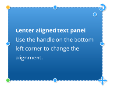
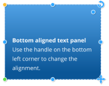
Designer now has improved support for nesting of embedded objects in text. For example objects embedded into a text panel, that is itself embedded in the main text flow of a document, now work correctly.Text Panel Alignment options
Text panels can now be top aligned, center aligned, or bottom aligned. Click the bottom left corner handle to cycle through the three alignment options for your panel. If you hold the mouse pointer over this handle, the tool-tip that appears shows you the current alignment setting for the panel. If the panel is full of text with no empty vertical space, then it will look the same no matter which of the three alignment options are selected. But the alignment setting also determines how the panel grows and shrinks, as text is added or deleted, so the setting is still relevant even for ‘full’ panels. Top aligned panels will always grow and shrink from the bottom, with the top edge staying fixed. Bottom aligned panels are the other way around - they grow upwards with the bottom edge fixed, so these are commonly used at the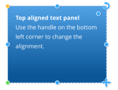
Page 11
bottom of pages. And centered panels will grow and shrink equally at the top and bottom, so the center of
the panel is fixed.
Text Panel size
Text panels are now also better at remembering the vertical size you have given them. Drag the bottom
center or top center handles to change the vertical panel height. If you ever add more text than can fit into
the panel at that height, the panel will grow to accommodate the additional text. But if you later remove
text, the panel will shrink back no further than the height you last set using the height adjustment handles.
This helps to keep panel sizes consistent, which is useful where you have a panel occupying a defined
space or aligned vertically with other panels or objects of the same height.