XARA DESIGNER PRO AUTOFIT
With the growing variety of document formats, especially social media, many designers face the
thankless task of re-creating documents in a bewildering array of sizes and shapes.
This applies equally to print documents. Should you create your design based on European A paper
sizes, or US letter / legal size, or both? And what if you want to convert documents from A5 to A4, or
A3 perhaps (or vice versa)? Or worse change orientation, from portrait to landscape?
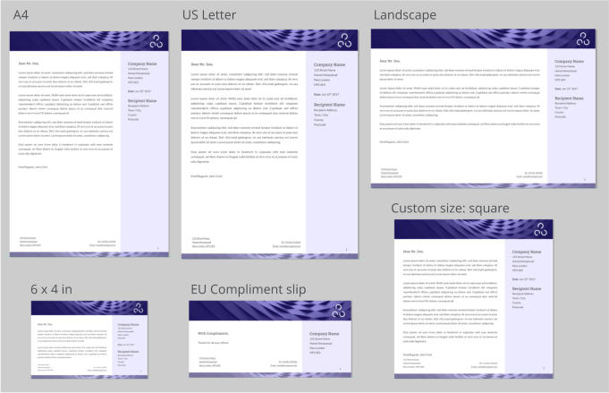
One design, just about any size you like
If you’re creating templates for use by customers, or for sale, it can be hugely time consuming to
adjust your designs to the different page sizes and orientations. But one thing you know for sure is
that it’s pretty annoying for your user if they select a template only to find it’s not available in the
page size they want!
But help is on hand. The latest versions of Designer have a new ‘auto-fit’ capability that enables you
to create flexible documents that adapt to almost any size change you or your customer might
want.
Last updated 16 November 2017
1
Xara Auto-fit feature description

Last updated 16 November 2017
2
Xara Auto-fit feature description
Social Media Documents
Auto-Fit means you can design your social media document once, and then easily deploy it to a
variety of sizes and aspect ratios:
One social design, automatically adapted to the sizes you need
How does it work?
Xara has had the ability to do limited automatic positioning of items on the page for some time. For example you could mark an item to be a footer that should be placed at the bottom of the page, no matter how large or tall the page. Typically these have been repeating items so they appear at the bottom of every page, and if you edit one, this edit is applied across all pages.
Facebook shared image

Instagram

Tumblr

LinkedIn
Last updated 16 November 2017
3
Xara Auto-fit feature description
We have not changed the way existing documents work, but we have added a new, much more
powerful set of controls you can apply to items on the page to determine how they should behave
as the page size changes.
The Auto-fit dialog
A new Auto-Fit dialog controls all of this. To access the new dialog, right click on any item on the
page and select the Auto-Fit to page… menu.
This dialog controls the new auto-fit
feature, which defaults to automatic
for all items in your document, but you
can control the behavior of individual
objects.
The ‘Auto-fit all objects’ checkbox
controls the automatic behavior of all
items in the document.
Important: With the checkbox off,
items that have specific manual
control positioning controls, listed
below, will still move. This check-box
just determines whether all other
objects should move or not.
The Auto-fit dialog controls how items move or stretch as the page size changes
Enable Automatic Fit
The Enable checkbox turns on the new behavior. It’s important to understand that even if this option is un-checked existing documents that had items marked as footers, or to stretch, will continue to behave the old way. This option just enables the new, more comprehensive, automatic positioning of items on the page.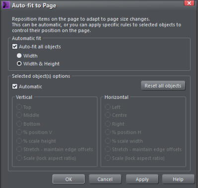
Last updated 16 November 2017
4
Xara Auto-fit feature description
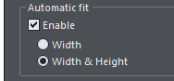
Width only or Width & Height
There are two distinct use-cases where you might want automatic positioning of items on the page:
1.
Websites, particularly ‘blog’ style websites where the pages are of variable length, depending
on how much text you have. Here you do not want the position of items on the page (typically
at the top of the page) to be moved as the page grows. In this case select the Width only
option. This means things will be repositioned when you change the page width, but not when
the page height changes.
2.
Print documents, Social Media documents or Presentations, where you want things to re-
position and stretch (automatically adapt) whenever the page width or height is changed. In
this case select the Width & Height option. This is the default when you enable Automatic Fit.
In Summary: For most document types, print, presentations and social media, select Width &
Height. For websites choose the Width only option.
To adjust the auto-fit rules for objects on the page, select the object and you can now just select the
auto-fit rules for both horizontal or vertical page stretching using the controls in the lower half of
the dialog.
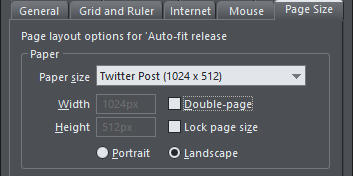
Testing: use drag-resize of your page
You can adjust the page size using the usual Page Size tab of the Options dialog. The easiest way to get to the page size options is to right click on the page background - select the last entry; Page Options. This is the section of the Page Options dialog where you adjust the page size: The Page Options dialog. The Paper size field has a drop-down list of common page sizes. So you can select a preset page size from the drop down, but a much easier way is to unlock the page, which allows you to drag the width and height to any desired value - it’s a great way to experiment with the new Auto-fit feature. To enable page size dragging, just un-check the ‘Lock page size’ option. Now if you move the mouse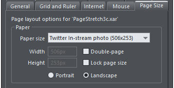
Last updated 16 November 2017
5
Xara Auto-fit feature description
pointer near the right or bottom edge of the page, the pointer changes to indicate you can drag the
edge to resize. It’s a great way to test the adaptability of your page design.
Mark the individual objects
Let’s return to the Auto-fit dialog. Once you have enabled the automatic fit option you can control the behavior of individual objects on the page. By default everything is marked as Automatic, but you can un-check this option and now apply any of the Vertical and Horizontal options, shown here, to the items on the page. Automatic When Automatic is selected items are re-positioned and/or scaled based on a simple percentage basis. So everything scales or moves in proportion with the page size change. If you make the page wider, things are moved horizontally but retain their same relative % position on the page. So a line that is 20% along the page will remain 20% along the new page width.Picture and Text resizing
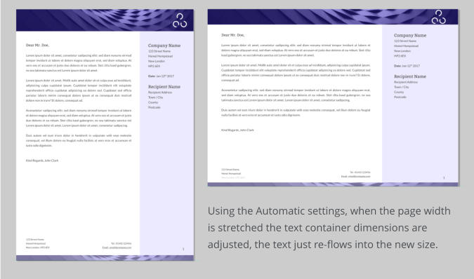
It’s important to understand that when a page is stretched (e.g. if you drag the right edge of the page to be wider), text items and images are resized, but the program does not distort the text or images. There’s nothing worse than a photo that has the wrong aspect ratio, or stretched text. So in the case of text objects, the container of the text is resized, but the text is not, it just re-flows within the new container size. So, for example, changing a page from A4 portrait to A4 Landscape the body text is not stretched, it remains the same point size, but the text frame is stretched.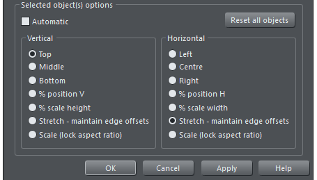
Last updated 16 November 2017
6
Xara Auto-fit feature description
You can see in the above case as the page is made wider (and less tall) the text remains the same
point size, but the text frame, and other items on the page have been resized in proportion.
This is the out-of-the-box behavior when everything is set to Automatic. Using the manual controls
you can optimize the behavior, so the width or height of items can be fixed for example. In the
above example you can see the height of the header and footer has become reduced as the page
height has reduced. This might not be what you want, and this is where the individual Horizontal
and Vertical controls come into play - described below.
Note: Compare with the examples on the top of this document where you can see the
headers and footer sizes do not change.
Photos
Designer has some really smart image resizing capabilities that come into play when resizing pages.
Instead of stretching the pixels (which looks terrible) we adjust the scale and clipping of the image
inside its frame.
You can still adjust the clipping, scale and rotation of the image within its frame with just a single
click.
Last updated 16 November 2017
7
Xara Auto-fit feature description
Special case: A5 to A4 or A3
But there’s a special case; when scaling a page up in proportion, for example from A5 to A4 or A3. The aspect ratio is exactly the same and in this case it’s more useful that everything, including text sizes and images, scale up in proportion (or scale down when going down a size). So if you ever wanted to change an A3 page to be A4 size, but want everything in the document to be scaled down so it looks identical to the larger doc (just smaller) then this is what Xara now does.When Text is Resized
If the page is made taller AND wider, then the text will be resized. The example below shows a small page on the left, and a much larger Facebook post size version, with approximately the same aspect ratio on the right. If we didn’t scale the text, then the Facebook one would have unreadably small text.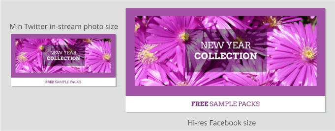
Last updated 16 November 2017
8
Xara Auto-fit feature description
Manual Controls
As mentioned above, Automatic is the default position, but you do have the option to control what happens when a page is resized on an item by item basis. With the Auto-fit dialog on screen, just select the item you want to control, un-check the Automatic checkbox - which will enable all the lower settings. You can now set the position rules for your selection. Click Apply to effect the change - you can now test the result by dragging the right or lower edge of your page to see how things move as you adjust the page size. Or alternatively in the Page Options dialog, select from the drop-down list of common page sizes.Reset all objects
This button will remove any and all manual auto-fit settings you have on everything in the document. This puts everything back to the Automatic setting.
Last updated 16 November 2017
9
Xara Auto-fit feature description
The Auto-fit options:
The Top, Middle and Bottom options for vertical adjustment and the corresponding Left, Center and Right for horizontal adjustments will keep the items the same size (they won’t be stretched, enlarged or shrunk) and at the same position relative to the edge or center. So items marked to be Right, will stay at the same current absolute position to the right edge. Items marked as Bottom will remain ‘attached’ to the bottom edge of the page. So if you want a footer to remain the exact same vertical size and vertical position relative to the bottom of the page, set the vertical options to be Bottom. Similarly if you want an item, perhaps a logo, to remain at the exact same offset in the top right corner, irrespective of page size, then set it to be Top and Right.% position
Items marked with either of these options will not change size as the page is enlarged or shrunk, but will just be moved to remain at the same relative position on the page. For example an item that is 1/3rd of the way across the page will always be 1/3rd across the page. This is the default behavior of items set to Automatic if Designer determines that the item cannot be stretched or squashed without distorting it (logos, shapes, symbols, etc.).% Scale height or width
This option scales the object in proportion to the page size change. For example if you make the page 10% taller the object will be stretched so it’s 10% taller too. This is the default behavior of items set to Automatic if Designer determines that the item can be stretched or squashed without distorting it (text, photos, rectangles, etc.).Maintain Edge Offsets
This option is useful where you want a fixed gap between the edge of the page and the item. For example if you have a photo in the top right corner of a page, you may have positioned it so that it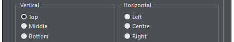


Last updated 16 November 2017
10
Xara Auto-fit feature description
has the same offset from the right edge of the page as it does from the top of the page, so that it
sits squarely in the corner. With default Automatic auto-fit behavior, if you made the page wider
the offset from the right edge of the page would scale up, so it no longer matched the top offset. If
instead you select the Stretch auto-fit options for the photo, the right and top edge offsets will
always match, no matter which page sizes you choose. The social media example below shows
another design where these options are very useful.
Scale (Locked Aspect Ratio)
This option is less often useful, but there are times when you may want items to enlarge or shrink as the page size enlarges or shrinks, but where the item must always keep its original aspect ratio. For example you may have a circle that you would like to grow or shrink as the page width or height is changed, but it must always remain a circle. Note: You can only turn the Scale (lock aspect ratio) on for both width and height, not just one or the other.An Example
This is a relatively simple social media graphic that is adaptable to just about any page size. With the Automatic options it would work, but the border width and height would not remain the same. So in this case specific items on the page have been marked to behave differently. In order to retain the same border width, irrespective of the width and height of the page, the photo has been marked to use Maintain Edge Offset, so this means the gap around the photo stays constant irrespective of the width or height of the page.

NEW YEAR
COLLECTION
FREE SAMPLE PACKS

Background rectangle:
Automatic

Photo: Stretch maintain edges

Footer Text panel:
Bottom: %scale width

Center Text panel: Automatic
Text is set to center vertically
and horizontally