Scroll through this document to see a description of all the great new features & content released in v15.
If you have an active subscription to Xara Web Designer+ purchased from Xara, then these updates are free. If you are
an owner of an older version purchased from Magix, then check out our current offers on upgrades.
You can see details on later updates in V16 here.


Page 1
Last updated 20-05-2018

Contents
June 2018 Content Update
A bonus content update! (Note: The full template set is only available in the Plus version). • 2 single page websites (Wellness and Software) • 3 Business Web Themes, Premium only (Superfood Store, Law Firm and Yoga Trainer) • 3 Presentations (Energy Drink, Food Delivery, Nature) • New Social Media graphics ( Company, Food Delivery, Security) • 4 new Tables, in Print & Web Components > Tables • A selection of new Text Panels, also in Print & Web Components - 21 Smart Layouts (more complex and interesting Text Panel SmartShapes), 5 Text in Shapes, 1 Smart Object, 1 Text in SmartShape. The latest content update includes some new and contemporary website designsMay 2018 Updates
Text inside shapes
You can now place text inside shapes, so that it flows within the shape’s outline. In fact you can add text to any type of object, even groups, as long as there is not already any text in the

Page 2
Page 3
object. Simply select the object, then go into the Text Tool and click on the object. A text area is created for
you on top of the object and you can enter your text and it will flow within the object’s outline.
Alternatively you can right-click on an object and select Add Text Inside from the context menu.
You can select, edit and format the text just as you would any other text and it will always format within the
outline of its containing object.
If the text won’t fit in the available space within the outline, it will overflow out of the bottom of the text
area, as with a normal text area.
In this case you need to take some action so the text will fit. You could reduce the font size or line spacing
of the text, make the container larger so it will fit more text, or reduce the padding margin (see below).
Padding Margin
The padding margin is the space between the shape outline and the text. Normally you will want at least a small margin as text flowing right up to the edge of a shape with no margin rarely looks good. You can change the margin in two ways. The easiest is to go into the Text Tool and drag on one of the small red arrows in the corners of the text area. As you drag, the text reformats inside the margin. The distance between the arrows and the corners of the red dotted box mirrors the same margin value, as an additional visual cue.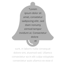
Page 4
Alternatively you can set the padding margin by right-clicking on the text area and choosing Text inside >
Properties…, which allows you to enter a value.
Selecting the containing object
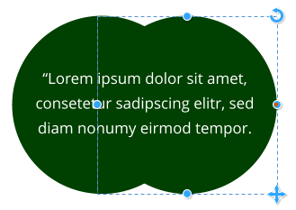
When you click on the object with text inside, you select the text area. The object within which the text flows (most commonly just a shape) is a child of that text area, so it behaves similar to a group. So if you move, copy, delete or resize the text area in the Selector Tool, the whole combined object is moved, copied, deleted or resized. If you want to select and edit the shape that contains the text, you can use Ctrl+click ,or right-click, Text inside > Select …. With the shape selected you can resize or edit it and then the text will re-flow within the new outline. A Group of 2 circles with text inside and one circle selected To make a copy of the shape without the text, select the shape, then copy and paste. To make a copy of the text without the shape, select all the text in the Text Tool, then copy and paste.
Page 5
Creating text filled shapes
If you want to create a text shape then all you need to do is to right-click the object and select Text inside > Select shape. Now switch into the Transparency tool and increase the transparency to 100%Content Catalog Text Inside Designs
The Content Catalog now includes some text panel designs that make use of this new feature of text inside shapes. See the Components > Print & Web Components > Text Panels folder (Insert > Shapes > More Text Panels …).Tables
Designer now includes tables. 15.1 supports basic table insertion and editing, including adding and removing rows/columns, resizing rows & columns, various table formatting options and automatic formatting of the table to fit contents. It has limited support for selecting and editing complete rows and columns - this aspect of table editing will be improved in a future update. Find tables in the Insert menu and also in the Content catalog under Components > Print & Web Components > Tables, where you will find a selection of attractive table designs.

Page 6
Table Handle Summary
Hover over the adjustment handles to see what they do. They are... Padding Drag to adjust the Outer padding, the Inner padding and the Cell padding. Select/Reposition Click to select columns and rows - drag to reposition them. Add/Remove Drag to add or remove columns or rows. Ctrl + Drag to stretch out the whole table. Show/Hide caption Click to show or hide the table caption title - edit using the Text tool. Column width Drag to adjust column widths. Row height Drag to adjust the height of the rows. Resize Drag to scale the whole table. Ctrl + Drag to change the width and height of the table, without changing the size of the table contents.Adding rows & columns
When you add a row , the last row of the table is duplicated to create the new row. If the table has different background colors for alternate rows, that formatting is maintained as you add more rows. Adding columns works similarly.Deleting rows and columns
Currently rows and columns can only be deleted by dragging the add/remove handles, which will delete only the last rows/columns. So if you want to delete any other row/column, first drag the select/reposition handle for that row/column, to make it last, then remove it by dragging the add/remove handle.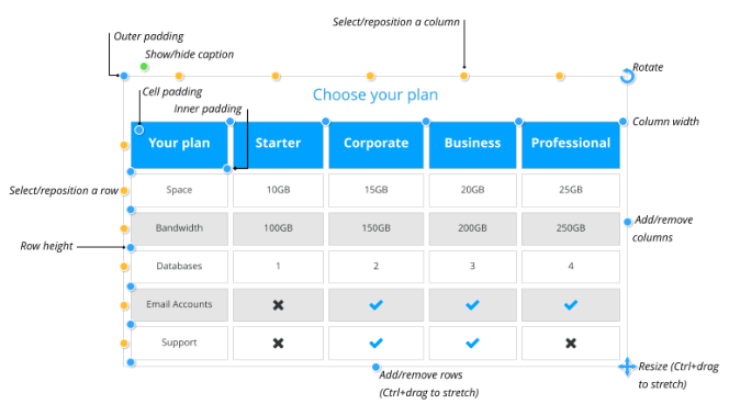
Page 7
Table cells
Each table cell has a text column and a background shape, which determines the background color of the cell. Use the Text Tool to edit and format text within the cell, just as you would edit any other text. You can also place any other type of object in a table cell by inserting it embedded in the text. To do this select and copy the object you want to insert to the clipboard, place the text caret in the cell and paste (Ctrl+V).Selecting inside tables to set background colors
The table as a whole has a background color and that determines the default color of each table cell. But each cell can have its own background color and you can set the color of a whole row or column of cells. If the table is not already selected, the first click on the table will select the whole table (you see all the table’s handles appear). Click on a color to change or replace any of the colors used in the table. With the table selected, clicking on a table cell will select that table cell’s background shape (the status line will show “1 shape inside”). Then you can set the color of that cell, or click ‘no color’ on the color line to reset it, so it will reveal the table’s background color. You can also change the color of all cells in a row or column by selecting the whole row/column. With the whole table selected, click on the row or column’s select/reposition handle. That selects all the background shapes in the row or column. You can then set the background color, or reset the background color, of all the selected cells.Outlines
With the whole table selected, the line width control on the top bar shows the width of the cell outlines for the whole table. You can change the outline width using that control, or remove the visible outlines by selecting ‘None’. You can also change the outline on a specific cell by selecting that cell and using the same line width control. And similarly on a whole row or column of cells, by selecting the row column. To set the color of the outline, right-click on the color line and choose Set line color.
Page 8
Resizable Photo Grids
The “Static” photo grid designs of earlier releases have now been updated to be resizable. See Components > Image Resources > Photo Grids in the Content Catalog. These are initially set to sizes that are commonly useful, such as square, 16:9, 4:3, etc., but once you’ve added them to your document you can change the width and height to make them any size and aspect ratio you like, from wide and short to tall and slim. Resizable Photo Grid Just drag on the side, top and bottom handles to resize. The photos are scaled, cropped or uncropped as you do this. Once you have the grid at the dimensions you want, you may need to adjust the scale and positioning of each image, to fit nicely in its new shaped frame. Go into the Photo Tool and click on each image to select, then use the adjustment handles on the photo to rotate/scale inside, or move the image in its frame. Note you can’t change the number of photos in these designs, or the layout, they are fixed designs. Use the grids in the Smart Photo Grids folder if you want grids that automatically adapt to any number of photos with any shapes.New Content
(Note: The full template set is only available in the Plus version). • Created using the new features: Table SmartShapes (in Components > Print & Web Components > Tables) and text panels with text flowing inside (in Components > Print & Web Components > Text Panels) • 3 new web stories (Food Delivery, Coffee Shop and Water Aid in Websites > Single Page Websites)
Page 9
•
2 new presentations ( Campsite and Consulting)
•
A selection of new social media graphics for Facebook, Twitter, LinkedIn and Instagram.
Other Improvements
• PDF import improvements • When stretching text or images using the Selector Tool top, bottom and side handles, Designer will try to avoid distorting them, because usually distorted text and images look poor. However you can now override this and stretch or squash the image/text by holding down the Alt key as you drag (alternatively you can revert to the old stretching behaviour by disabling Smart Transform by right clicking on the lock aspect ratio icon).November 2017 Updates
Auto-fit
The latest Designer has a new ‘auto-fit’ capability that enables you to create flexible documents that adapt to almost any size change that you or your customer might want. This is particularly useful for your social media headings, where for example you can now easily change your Facebook cover or post to Twitter or Linkedin or Instagram simply by selecting a new document type. The default position is for all items on a page to be automatically repositioned when you change the page size, but Web Designer actually offers a great deal of flexibility if you want to control how particular items in your design behave. We have created a separate document covering these advanced options here.Text Improvements
List Styles
Text styles now support formatting of bulleted and numbered lists. To make a list style, first create a list and customize it using the List Properties dialog. Then place the text caret in the list, or select part of the list, and choose Create style … from the text styles dropdown list. Choose a name for your list style and click OK. List styles appear in the styles list marked with so you can distinguish them from paragraph and character styles. List item 1 level 1 List item 1 level 2 List item 1 level 2 List item 2 level 1 List item 3 level 1 List item 3 level 2
Page 10
List styles include all the list settings you see in the List Properties dialog, from indents to bullet symbols
and colors. Each level within a list can have different settings and these are also all recorded in the list style.
The example above has only 2 levels of list, but you can have as many levels as you like.
To update a list style, simply modify a list that uses the style and then use the Update option in the styles
list, the same way you update ordinary paragraph styles.
Graphical lists (where you can use any graphical object as the bullet or number) are not yet supported with
list styles.
Next paragraph style
This is one of the settings for a text style. For paragraph styles it determines what style should be applied
by default to a new paragraph created following the current paragraph. For example heading styles
normally set the Next paragraph style to Normal text, because that’s usually what you want immediately
following a heading. With a list style however, it’s more likely that you want another list item to be added
when you hit return at the end of a list item. So for list styles the Next paragraph setting is only used when
you end a list. End a list by hitting return once to add an empty list item, then hit return again. The new
non-list paragraph will then use whatever Next paragraph style you chose for the list style.
Anchored objects and text flow
Anchored objects now have a new setting that determines what happens when they reach the bottom of the text area to which they are anchored. Usually it’s not desirable to have the object extending below the bottom of the text area, or even perhaps partially off the page. Instead it’s better to force the text to which the object is anchored to flow to the next page or column, taking the anchored object with it. Therefore this is now the default behavior for newly anchored objects. However it’s controlled with a new Affect text flow checkbox in the Repelling & Anchoring dialog, so you can turn this off if required. And it’s off for existing anchored objects, to avoid changing the way existing documents are formatted.Embedded object nesting
Designer now has improved support for nesting of embedded objects in text. For example objects embedded into a text panel, that is itself embedded in the main text flow of a document, now work correctly.Spell Checker language property
Designer now has a new “language” document property. This determines what language new text added to the document will be set to, for the purposes of spell checking, instead of assuming the document language should be the same as the language your device is set to. This new property can be seen and modified with the new Document language option in the Spell Checker menu in the Text Tool. You can still set any text in your document to any language, regardless of what the “Document language” property
Page 11
is set to, so you can still have a mixture of languages in your documents when required.
If you change the current document language, you are asked whether all existing text in the document
should also be set to the chosen language, or left unchanged.
When you open an older document, the document language is automatically set according to the language
on the Normal text style in that document. Newly created documents have their document language set to
match the language setting of the current device, as with previous versions of Designer.
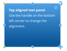
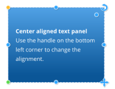
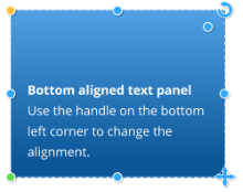
Text Panel Alignment options
Text panels can now be top aligned, center aligned, or bottom aligned.
Click the bottom left corner handle to cycle through the three alignment options for your panel. If you hold
the mouse pointer over this handle, the tool-tip that appears shows you the current alignment setting for
the panel.
If the panel is full of text with no empty vertical space, then it will look the same no matter which of the
three alignment options are selected. But the alignment setting also determines how the panel grows and
shrinks, as text is added or deleted, so the setting is still relevant even for ‘full’ panels. Top aligned panels
will always grow and shrink from the bottom, with the top edge staying fixed. Bottom aligned panels are
the other way around - they grow upwards with the bottom edge fixed, so these are commonly used at the
bottom of pages. And centered panels will grow and shrink equally at the top and bottom, so the center of
the panel is fixed.
Text Panel size
Text panels are now also better at remembering the vertical size you have given them. Drag the bottom
centre or top centre handles to change the vertical panel height. If you ever add more text than can fit into
the panel at that height, the panel will grow to accommodate the additional text. But if you later remove
text, the panel will shrink back no further than the height you last set using the height adjustment handles.
This helps to keep panel sizes consistent, which is useful where you have a panel occupying a defined
space or aligned vertically with other panels or objects of the same height.
Page 12
Hyphenation
Hyphenating long words at the ends of lines in a flowing paragraph of text allows more text to fit on fewer lines. This is especially important with fully justified text to reduce the “rivers of white” problem, where a lot of white space has to be introduced to pad out each line to the exact width of the text column. In earlier versions of Web Designer, words were only hyphenated if they contained an actual hyphen character or had a soft hyphen added manually. Web Designer now includes automatic hyphenation as a new paragraph attribute. It uses a combination of built-in hyphenation rules, language-specific hyphenation dictionaries and even an optional list of custom hyphenations for each document. With the following full justified paragraph example, note how the spacing of the second line of text is much better when hyphenation is on. Hyphenation Off Hyphenation On To turn the auto hyphenation feature on or off - click on the hyphenation button in the flyout bar at the end of the text tool InfoBar. Remember this is a paragraph option, so select the text to which you want to make the change first.Hyphenation Settings
To change the hyphenation settings for the current document, click on the Hyphenation Settings option in the drop down menu of the spell checker . The settings dialog will appear.


Page 13
You can control the size of the shortest word that can be hyphenated, as well as how far from the
beginning and end of a word hyphens can be introduced.
Adjusting the Hyphenation Zone will change the degree of "raggedness" before hyphenation is applied. So
for example, with left justified text this would be the size of the margin to the right that would be empty
without trying to fit in more text using automatic hyphenation. With right justified text this would be the
margin to the left, and with fully justified text this would be empty areas - "rivers of white" between words.
Increasing the zone allows less hyphenation, and consequently more white space. The Hyphenation Zone
can be expressed as an absolute value as in pixels, mm, etc., or as a percentage of the width of the text
object (the default is 5%).
Use the Consecutive Hyphens fields to limit the number of consecutive lines that can end in hyphenated
words. The Attenuation setting specifies a "soft" limit on this, so that you can set a balance between having
consecutive hyphenated lines and lots of white space on following lines. A useful value is between 5% and
10%. Values higher than 20% often inhibit consecutive hyphens so much that they no longer occur at all.
The final three checkbox options allow you to choose whether ALL-CAPS WORDS, Capitalised Words and
the last words in a paragraph can be hyphenated or not.
Custom hyphenation lists
You can add hyphenation rules to your document for specific words . Click the Edit document hyphenation list button on the settings dialog. The dialog shows the current list of words for the current document and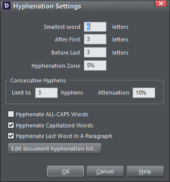
Page 14
allows you to enter new words. Use the tilde “~” character in a word to specify the hyphenation point(s) for
that word. Or if you want to prevent a word from being hyphenated at all, enter the word without any tilde
“~” characters in it.
Personal hyphenation lists
Each time you add a word to the hyphenation list for a document, that word is also added to a personal hyphenation list stored on your computer. Similarly, removing a word also removes the word from your personal list. This list is automatically applied to all new blank documents you create (File->New), so you don’t need to keep adding the same words to all your documents. However when you open an existing document, your personal hyphenation list is NOT automatically applied to it, because that could change the way the document appears. It would mean that two people opening the same document, could potentially see different results, because of their different personal hyphenation lists. So instead applying your personal list to a document has to be done explicitly - simply press the “Import my list” button on the Document hyphenation list dialog.Hyphenation in websites
You can use hyphenation in your websites, but since Designer controls the exact length of each line of text in the website HTML (so that you get an accurate representation of your page in all browsers), words that are hyphenated at the ends of lines are broken into two parts. This means search engines won’t index your site on these broken words.Multi-weight font improvements
We’ve made some significant changes to the way that Designer handles multi-weight fonts. Prior to this update if a font was updated so that its multiple weights were presented in a different structure, this could cause Designer to show missing font warnings for documents that had been created using the previous version of the font. Now any such changes to a font should be transparent, so you can update to a newer version of the font without encountering any problems with existing documents that use that font. This update also has improved handling of the Bold button with multi-weight fonts. Prior to this update, Designer would not allow bold to be turned on if the selected text used anything but the regular variant of a font. Now it will work with any variant, automatically choosing the most appropriate heavier weight variant of the same font. For example if you have some Open Sans Light text selected and you press the Bold button, the text will appear as Open Sans Regular.
Page 15
SmartShapes and Symbols
Flowline SmartShapes
Great for flowcharts, diagrams, exploded views, etc. The Flowlines behave just like Arrows, in that you can change the heads and tails, apply rotation, thickness and so on - as well as having 90° segments which you can drag to reposition. Find them in the Arrows folder - Insert > Shape > Arrows…Bar & Column chart label and value text
Now when you change the appearance of a chart label, such as changing the font, font size or color, that change is immediately replicated across the other labels for each bar. However this only happens if those other labels have the same text style applied (usually “Bar chart labels”). So if you want one of the labels to be different, perhaps to highlight one of the bars, simply give it a different style or use the No style option in the styles menu to remove the style. The same happens with the value text.Replace Symbol
To replace a symbol, right-click on it and choose Replace symbol… from the context menu. This brings up the symbol picker, where you can search for a new symbol. You can also use this operation in bulleted lists to replace the symbol used for the bullet points. Place the text caret in the list, right-click and choose Replace symbol… this now also works if the symbol is inside a group so you don’t have to perform a “select inside” operation first.Photo Filters
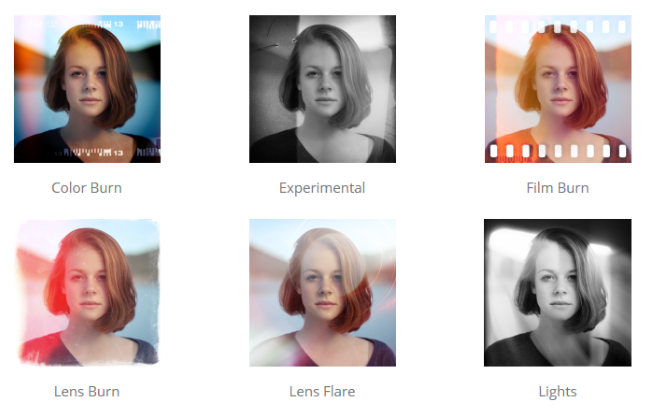
There are 10 new Photo Filter Overlays with camera effects such as burn and flare, great for making a more eye-catching social media profile!


Page 16
Some of the new Photo Filter Overlays
New Content
(Note: The full template set is only available in the Plus version). We’ve added a selection of new templates to the Content Catalog: • 6 new text panels • Many new social media templates for Facebook, Twitter, Instagram, LinkedIn, Pinterest and Tumblr • 3 new presentation themes (Business, Travel & Water) • 2 completely new single page themes (Simple & Cameras) • A new business web theme (Auberge)Other Improvements
• List editing improvements. • PDF Import improvements. • Word import improvements. • Various other minor fixes and improvements.