Last updated May 18, 2020


Scroll through this document to see a description of all the great new features & content released in March 2021
(v 18.0) and August 2021 (18.5).
If you have an active subscription to Xara Designer Pro+ (available standalone or included in Xara Cloud Pro+,
our great value bundle of Xara Cloud and Designer Pro+) purchased from Xara, then these updates are free. If
you are an owner of an older version purchased from Magix, then check out our current offers on upgrades.
You can find Release Notes for the earlier Designer Pro X17 here.
And you can find Release Notes for Designer Pro X19 here.

Version 18.0 (29 March 2021)
Workflow Improvements
High DPI Display Support
• Designer Pro X now makes best use of the screen resolution whatever the Windows scale factor is set to. • On high-resolution screens, like 4K Monitors and devices like Surface Pro tablets, document display is sharper. • Even on lower resolution screens, you can now use the Windows display settings to make the controls bigger, while the document display still uses the screen’s full resolution.Selection UI
Shape Tool The Shape Tool now has improved selection handles, similar to those recently added to the Selector and QuickShape tools. New Shape Tool handles QuickShape Tool Also the QuickShape Tool now shows a reduced number of handles, but retains all the same capabilities. Previously some handles were duplicated around each vertex of a shape, each performing the same function.


Reduced number of handles in the QuickShape Tool
Selector Tool
The Selector Tool InfoBar used to have a button
for toggling between SmartShape and transform
modes, which only really affected SmartShapes. Now these two modes have been combined, so the toggle
button has been removed.
Improved CMYK color display
Designer Pro X now has improved display of CMYK colors on screen, and also in all export formats that require conversion of CMYK colors to RGB. These color conversions now use a standard Color Profile. In this release there are not yet any user controls for changing the Color Profile used, or for using a custom profile, but these further improvements will be coming in another releases.Desktop Publishing
Header Designs
Like the Footer components in the last release, the new Header designs are components which automatically size and position themselves at the top of the page on insertion. They are also made repeating on insertion, so that they appear on every page of your design. Example Header design To view the available designs and insert them, use Insert > Header ….which opens the Online Content Catalog at the selection of footer components. If you insert a new header when there is already a header in the design, the new header replaces the old one and where possible the content of the old header is maintained in the new header.Google Fonts Update
44 new fonts have been added to Designer Pro X: Akaya Kanadaka, Akaya Telivigala, Andik, New Basic, Ballet Benne, Big Shoulders Inline Display, Big Shoulders Inline Text, Big Shoulders Stencil Display, Big Shoulders Stencil Text, Bodoni Moda, Brygada 1918, Castoro, Commissioner, DotGothic16, Fraunces, Goldman, Grandstander, Hachi Maru Pop, Imbue, JetBrains Mono, Kufam, Kumbh Sans, Langar, Libre Barcode EAN13 Text, Nerko One, Newsreader, Oi, Piazzolla, Potta One, Reggae One, RocknRoll One, Sansita Swashed, Shippori Mincho, Shippori Mincho B1, Space Grotesk, Stick, Syne, Syne Mono, Syne Tactile, Texturina, Trispace, Truculenta, Xanh Mono, Yusei Magic.


Web Design
New Web Export Tab
The old Web Export Options dialog has now been replaced by a new Export tab in the Utilities > Web Properties dialog. This brings these options, which control how your document or website appears when published to the web, together with other web settings all in the same dialog. New Export tab of Web Properties The Transition Effect and Direction have been separated into two controls, instead of a single combined control. Also you now have more control over what features are enabled in your web document or website, in the Viewer Options section at the bottom of the dialog, as follows: Page previews This option allows you to choose whether or not you want the page navigation panel along the bottom of the browser window. The panel allows a viewer to navigate directly to any page by clicking on a page preview.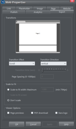

PDF download
If this option is checked a Download button is added to the top right of the browser window, that allows
the viewer to download your document as a PDF file, for printing or offline viewing. When this option is on,
the PDF file is generated and published for you automatically along with the web view, each time you
publish.
Xara logo
This option determines whether or not the Xara logo is shown in the top left corner of the browser window.
Note that whenever the PDF download option or the Xara logo option are on, a bar is added across the
top of the browser window that also includes a Full Screen button. But if neither of these options are on,
the bar is not present and so neither is the Full Screen button.
Presentation document with all 3 options enabled
Web Preview Operations
Furthermore, the Web Preview operations now open your document/website directly in your default web browser, instead of in an internal preview window.
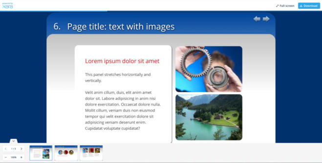

Photo & Graphic Design
Smart Duplication
The new feature Smart Duplication allows you to quickly duplicate an object multiple times horizontally or vertically, with the copies equally spaced. With all the objects selected you can then also adjust the spacing. Turn on Smart Duplication by pressing the new button on the Selector Tool InfoBar. With this option on you’ll see that most objects will have handles around them. Selected object with Smart Duplicate handles on Drag the right handle rightwards to duplicate objects to the right, drag the lower handle down to duplicate downwards, etc. Object duplicated 3 times, equally spaced You can then adjust the spacing by dragging the spacing handle shown near the top right corner of the selection. If you want to keep the selected objects centered, hold the Shift key down while dragging. You


can also use this feature to quickly adjust the spacing of any set of selected objects, horizontally or
vertically. Just select them all and drag on the spacing handle, to equally space the objects.
PDF 4.0
With this release the PDF editing experience has been taken to the next level, including multiple PDF import and accuracy improvements, plus the following changes to font handling when editing imported PDFs. PDF Fonts Most PDF files include a definition of all the fonts that are used by the text in the PDF, so text can be displayed accurately by any PDF Viewer. So when opening a PDF, Designer Pro X is able to import these fonts too. However in previous versions these fonts would not always be used - Designer Pro X would often use a similarly named locally installed font instead. This meant that the appearance of text could vary, depending on what locally installed fonts are available on the device. This resulted in an inconsistent PDF editing experience. Now Designer Pro X will always use the fonts from the PDF (if they are included), so all text should always appear exactly as the document author intended, on any device. They all have a PDF- prefix on their names, so you can easily distinguish them from your locally installed fonts. Font Replacement One problem with the PDF fonts is that they usually only include characters that are used in the text of the PDF. That helps keep PDF file sizes small. So if you type a character that was not in the original document, it can’t be displayed correctly. In earlier versions, Designer Pro X would silently use a different font for such missing characters, so they would usually not match the rest of the text. And this could easily go unnoticed initially. So now Designer Pro X will prompt you if you ever enter a character that is not available in the PDF font that is being used. It offers you the chance to replace the font with a local installed font, throughout the entire document. Alternatively you can choose to ignore the problem and continue using the PDF font. Then you will not be warned again about missing characters for that particular font, in the current editing session. This improvement means you can confidently edit text using the original font, without having to visually check the text for consistency. If ever you type a missing character, you’ll be alerted and you can then decide either to switch to a different font, or avoid using the missing character(s).Content Update
As usual we have some great new additions to the Online Content Catalog (Note: The full template set is only available in the Plus version).
•
10 new Header designs in Components > Print & Web Components (*New category)
•
10 new presentation templates in Presentations > Presentation Themes
•
3 new Photo Panels in Components > Image Resources
•
4 new Text panels in Components > Print & Web Components
•
5 new tables in Components > Print & Web Components
•
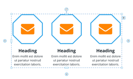
6 new diagrams in Components > Print & Web Components
•
30 new Facebook templates in the Social Media category
•
30 new Instagram templates in the Social Media category
Final Notes
As with every release we’ve also implemented a large number of minor enhancements including improvements and fixes to import and export formats like SVG, PDF, Word, PowerPoint and InDesign.Version 18.5 (24 August 2021)
WebP Image Export
WebP is a new image format that is an alternative to the well established JPEG and PNG. It uses new compression technology that allows image files to be smaller than JPEG or PNG image files of similar quality. Therefore it’s particularly suitable for use with images in websites and web documents, which will open faster if viewed in a web browser that supports WebP images, which most modern browsers now do.Exporting Individual Images
WebP has been added to the extensive list of file formats that Designer Pro can export. Select the object or image that you want to export and choose File > Export WebP … . This option is also available on the right- click context menu. Choose a filename and folder location and click the Export button to export with default/previous settings, or click the Settings button to open the settings dialog.
WebP Export Settings
Here you can choose whether to export the current selected object(s), the current page contents, or the
whole of the current page including the page background. You can also choose the size of the image you
want to export, by entering the required dimensions in pixels, or choosing the resolution required (DPI
field).
Transparent background
If you select the Transparent option the image will be exported with a transparent background, so that it
can be placed on any background. With this option off, whatever background you see behind the selected
object(s) will be included in the exported image. Normally if you are exporting individual objects it’s best to
select the transparent option, but if you want an image of a whole page including the page background,
turn transparency off.
Encoding
WebP files can be either lossy or lossless. With a lossy file, some image detail is lost in order to achieve a
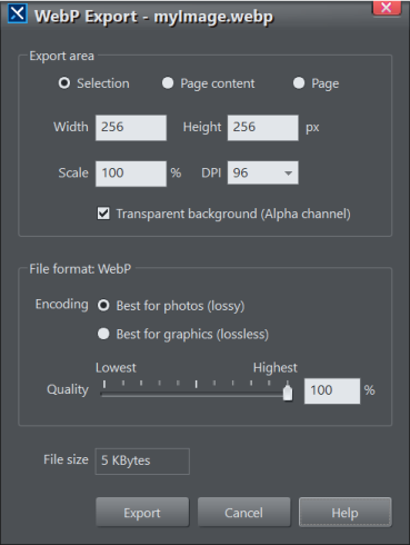

smaller WebP file size. With a lossless export, full image detail is retained. So for the same image, a lossless
WebP file will typically be larger than the equivalent lossy file.
For the best balance of file size versus image quality, it’s generally best to export photos as lossy and
graphics as lossless.
Quality
With the lossy (best for photos) option selected, the quality controls are enabled so that you can control
the balance between image quality and file size. The file size that will result from the current selected
settings is displayed at the bottom of the dialog.
WebP Images in Websites
You can choose to have all the images in your website or document automatically exported as WebP, so that images will appear faster when your website/document is viewed in a browser that supports WebP. Simply turn on the new Include WebP images option, which is at the bottom of the Website tab of the Utilities > Web Properties dialog.Browser Compatibility
While most modern web browsers now support WebP files, some still do not, so it’s not yet advisable to provide images only in WebP form. So with the WebP option on, Designer Pro will automatically encode all your images in WebP AND also in either JPEG or PNG form, to maximize browser and device compatibility. And it will make sure browsers that do support WebP will only download and display the WebP files, realizing the benefits of a faster web browsing experience with WebP. While older browsers and others that don’t support WebP will download only the JPEG or PNG files instead. This does mean that previewing and publishing your website/document will take a little longer with the WebP option enabled, because of the additional image encoding that has to occur. If this delay is significant for your document, it’s best to turn off the WebP option while you work on your design, so that preview is faster, and then turn it on again just before publishing.WebP Image Import
Designer Pro can now import WebP images as well as export them. As with other image file types, you can simply drag and drop a WebP image file onto your document from Explorer, or use File > Import to browse for your WebP file.New Timelines & Smart Diagrams
These are in the following folders of the Online Content Catalog:
Components > Print & Web Components > Timelines
Components > Print & Web Components > Diagrams
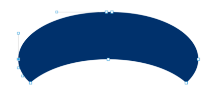
These components have internal elements that can be easily re-arranged, duplicated or deleted, without
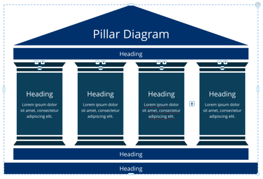
spoiling the designs. For example in this Pillar Diagram below, you can easily choose how many pillars you
want.
3 Pillar Diagram …
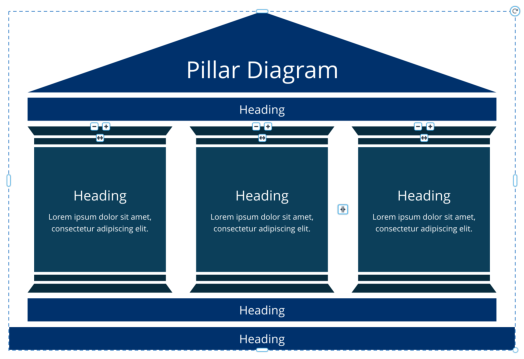

… 4th Pillar added
Each pillar has a set of 3 handles on it:
•
Click the
handle to delete a pillar
•
Click the
handle to add/duplicate a pillar
•
Drag on the
handle to change the order of the pillars.
There is also a single spacing handle
that you can drag to adjust the spacing between the pillars.
As you change the number of pillars, Designer Pro tries to maintain the current width of the component as
much as it can. But if you add more than can be fitted in the current width, the component will get wider.
And, as with all components, you can drag the width and height handles on the outside of the component
to adjust the size. Or use a corner resize handle to scale the whole component up or down, but note that
this will change the text sizes too.
The same principle applies to the other Timeline and Diagram designs in the Content Catalog. They each
have similar elements inside them, as indicated by the same set of 3 handles. So for example the Timeline
shown below lets you choose how many labeled circles you would like along the arrow.


Timeline with 4 bullet points
Some of the components have parts stacked vertically instead of horizontally, but the same principle
applies in the vertical direction.
Template Locking for Xara Cloud
Designer Pro already had support for completely locking an object, so that clicking or dragging on the object will do nothing. This is very useful in Designer Pro and in Xara Cloud, for objects in the background, behind text for example. It prevents users accidentally moving or selecting the object, when they intended to work on objects on top. It can also be used by template designers to discourage users of a template from making unnecessary design changes - for example locking a company logo in place, so users can’t move or change it. However template designers need more flexibility, so they can lock different aspects of an object in their design, while still allowing some customization of that object by users of the template.New Lock types to restrict Xara Cloud editing
To achieve this flexibility we have introduced 2 new types of locking to Designer Pro and Xara Cloud. Designer Pro is often used for creating and editing templates that are deployed with Xara Cloud, so these two new types of lock can be applied using Designer Pro, but the locking is only enforced in Xara Cloud. In Designer Pro the objects can still be edited without restriction. Lock Size & Position This lock prevents an object from being moved or resized in Xara Cloud. So when such an object is selected, the user won’t see any handles for changing the object size. But users can still edit the content of the object. For example if a photo is locked in this way, a user can still change the photo image, using Replace Photo, as normal. But they can’t move the photo, resize it, or change its shape. The same principle applies to other types of object with this lock - that is, they allow content editing, while maintaining the object’s size and position in the document.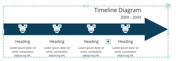

Photo selected with Lock Size & Position
Lock Aspect Ratio
This lock prevents users from changing the aspect ratio of an object in Xara Cloud, for example by
stretching it wider or taller. Such objects can still be moved and also resized by dragging a corner resize
handle, but no handles are shown for changing the width or height of the object. Content can still be
edited, as with the Size & Position lock.
Photo selected with Lock Aspect Ratio
Locking Dialog
The new Locking dialog is opened with Utilities > Locking …

Locking
The Lock All option is the original Designer Pro locking whereby the locked object can’t even be selected.
With this lock the object can only be unlocked using the Page & Layer gallery, as in previous versions of
Designer Pro.
The Only Admins can unlock in Xara Cloud option prevents ordinary Xara Cloud users from overriding a
lock on an object. So this option allows template designers to determine whether a lock is just advisory
(users of the template can choose to turn it off), or compulsory. However this restriction does not apply to
Administrators of the Team in Xara Cloud.
Object Right-click Menu
You can also view and change lock settings using the right-click context menu on any object. There is a Lock sub-menu, that gives quick access to all the same settings available in the Locking dialog described above. There’s also an option to open the Locking dialog itself from this menu.Open Graph
Open Graph gives you control over how your website is presented when you post a link to it on social media. You can set image, title and description, which stops the social media site making a best guess on your behalf. For example if you paste www.xara.com into a Social Media app, the app will show the graphic below, which is published as part of the Xara website.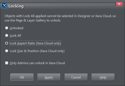

Now you can easily create and include a similar graphic with your website and web documents.
Setting the title and description gives you the opportunity to improve your page rank by including your top
keywords.
Open Graph Dialog
The Utilities > Web Properties dialog has a new Open Graph tab.

Open Graph Dialog
Enable Open Graph for your website or document by selecting the Enable checkbox at the top. Then you
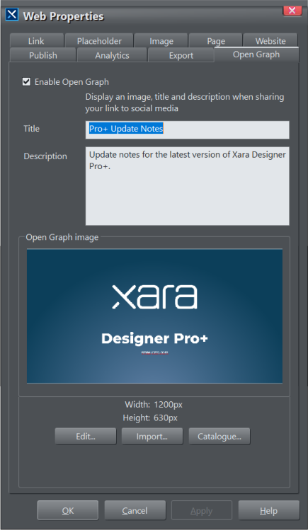

can enter the Title and Description you’d like to appear as part of your site’s preview. If you already added
Title and Description in the Website tab of this dialog, the same text will appear here by default, but you
can change it if you like.
Below the Title and Description you can see the current Open Graph image that is set for the current
document. By default you will see a relatively simple graphic with a logo in the center. There are a selection
of other Open Graph image designs to choose from in the Content Catalog - just click the Catalog…
button below the preview image to browse and select one. Or, if you already have a suitable image you’d
like to use instead, just click the Import… button to import it.
Where a design includes a logo, if the document you are editing already includes a suitable logo, it should
be used in the preview image by default. If not, or you want to change the logo, you need to edit the image
design.
Editing the Open Graph preview image
Click the Edit… button and a new document tab will open containing just the Open Graph preview image
design for the current document. Here you can edit the graphic just as you would edit any other content
within Designer Pro.
•
Select the Text Tool to edit the text
•
Right-click on a logo and choose Replace… to replace a logo
•
Right-click on an image or photo and choose Replace photo… to replace
You can change the dimensions of the design if you want, but the default size is recommended for best
results on most Social Media platforms.
When you’ve finished editing, you can Ctrl+S to Save and return to your main document, or click the Save
button in the Open Graph dialog, or just close the tab.
Finishing & Publishing
Press OK or Apply in the Open Graph dialog when you have finished setting it up. Now just publish your website or document as normal and then try pasting a link to it into a Social Media platform to see your preview appear.Shape Editing Improvements
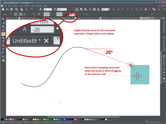
When the end point of an open bezier curve is selected in the Shape Tool the InfoBar now shows the angle of the tangent and allows the user to edit it numerically. This helps when aligning the curve with other rotated objects in a drawing. The open end points of bezier curves now project tangential angled constraints for the Smart Snapping
system to use. When dragging other objects in the Selector tool, press “A” to turn on Angle snapping, and
when any snap point gets close to the tangent the point will be snapped to the tangent with indication. This
helps when aligning objects to the angle from the end of the curve.
Numerical control of the angle of the tangent and improved snapping
Final Notes
As with every release we’ve also implemented a large number of minor enhancements including improvements and fixes to import and export formats like SVG, PDF, Word, PowerPoint and InDesign.