Update Service
Xara Online Designer (June-17)
Selection Improvements
Selector Tool Handles (June-17)
Selection of Embedded, Anchored and
Repeating objects (June-17)
Photo Features
Smart Photo Straighten/scale
Photo Grids
Photo Filter Presets (Updated Oct-16, Feb-17,
June-17)
New Blend Modes
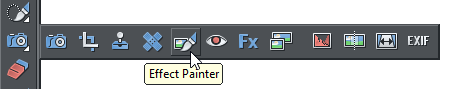
Effect Painter Tool (Updated Oct-16)
X Process Effects
Magnetic Lasso (Updated Oct-16)
MAGIX Photo Manager 16 (Oct-16)
SmartShapes
Improved SmartShape editing
Chart SmartShapes
New Text Panel Designs
Vertically Aligned Text Panels (June-17)
Packed Photo Grid
New Simple SmartShapes
New Chevron Bar Smartshape (Oct-16)
New Timeline SmartShapes (June-17)
SmartShape API for Developers
Online Content Catalog
New Design
Keyword Searching
Release Notes


Page 1
Last updated 22 - November - 2017

Photo & Illustration Software

V12 Headline New Features
Scroll through this document to see a description of the new features in v12.
If you have an active subscription to Xara Photo & Graphic Designer+ purchased from Xara, then these
updates are free. If you are an owner of an older version purchased from Magix, then check out our
current offers on upgrades.
You can find details on updates after November 2017 (v15) here.
Stock Photos (updated Oct-16)
Stock Illustrations (Oct-16)
Local Designs Gallery
Symbol Library
Automatic Updates
Symbol Search
Replace Symbol
Text Handling Improvements
Ligatures (June-17)
Hidden Text Styles (June-17)
Improved support for multi-weight
fonts (June-17)
Rectangular Repelling Option
OpenType Font Kerning
Change Case of Selected Text
Change Language for Entire
Document
New Advanced Text Toolbar
Bullet & Numbered Lists
Other Text Improvements
Page & Layer Gallery
Object Naming
Import/Export
Improved Photoshop (psd) Import
and Export
Improved PDF Import
Improved Word Import & Export
Improved RTF Import & Export
Improved SVG import (Oct-16)
More Content & Improvements
Update Service
We know that many of you find it frustrating to have to wait a whole year for our next update - knowing that we are working on (and likely finished) new cutting edge features and on-trend content. From our side, developing features for 12 months before they are released is equally frustrating. We would rather get features into your hands as soon as they are done. So we’re changing the model. We are moving away from yearly releases, and even from ‘headline’ version numbers. For the 365 days from purchase you’ll get access to new feature, updates and content. At the end of the 365 days you can choose to upgrade again, or not. If you choose not to, then the online services (the Online Content Catalog) will be removed or restricted (these are online services anyway that would typically be part of a subscription). It’s important to note that this is not a subscription service. Unlike other products such as Office 365, or Adobe Creative Cloud, the program you purchase is yours to keep, and will keep functioning with no further purchases, but after 365 days you’ll stop getting access to updates, new content, and the online services if you choose not to upgrade. This new approach also means features developed during the next year, which would typically be part of next year’s update, will be made available as soon as they are completed. So you’re getting next year’s features included in this year’s product. We believe this move away from once-a-year major updates towards a more regular update process is better for our customers. The Update Service gives you 365 days access to: • The new Online Content Catalog, including any new templates, graphics and designs, photo filters and SmartShapes released during that time • New features, upgrades and patches to Photo & Graphic Designer released in the 365 days after you purchase and register. Note: these updates continue to work after 365 days but if you reinstall the software after the Update Service expires (and you don’t renew) then it will fall back to the version you last purchased.
Release Notes
Page 2
Photo & Illustration Software


Xara Online Designer (June-17)
This is a totally new addition to Photo & Graphic Designer for June-17 Xara Online Designer offers an innovative and ultra-simple way to view, edit and update Xara documents using a web browser on any computer or tablet (yes, even a Mac or Android tablet!), from anywhere in the world. What's more, Online Designer includes a small but growing number of templates that you can open, edit and publish (or save to PDF) such as CVs, social media headings, flyers - without even using the desktop software! Online Designer also gives you the ability to work on documents in collaboration with friends, colleagues and clients. Online Designer is still in beta but it’s progressing rapidly, you can see the Update Log here. Online Designer is included in the latest versions of Photo & Graphic Designer while it is in beta. You can sign in to Xara Online Designer @ https://cloud.ixara.com - see our Outsider Tutorial An Intro to Online Designer for information on how to get started.Selection Improvements
Selector Tool Handles (June-17)
Now when you select a photo or SmartShape in the Selector tool, you see smart handles without having to first switch into the Photo Tool or Quickshape Tool, so you can directly edit these objects without having to switch tools. You can revert to showing the normal selection bounds handle using the toggle button on the left of the Selector Tool infobar.Selection of Embedded, Anchored and Repeating objects (June-17)
When you embed a single object in text, you can now directly select that object in the text instead of selecting the “Embedded group” that encloses it. A similar improvement has been made for anchored objects and repeating objects.
Release Notes
Page 3
Photo & Illustration Software

Release Notes
Page 4
Photo Features
Smart Photo Straighten/scale
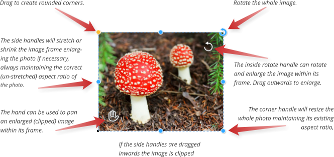
The Photo Tool includes a new ability to more easily scale, rotate, crop and pan clipped images within their frame. This also makes it much easier to straighten the horizon on images without introducing gaps in the corners, to create rounded corners on your photos, and to adjust the shape of your photo frame without distorting (stretching) the photo. In the Photo Enhance Tool (camera icon) click on a photo to show a set of new control handles, some around the outside edge of the photo, some inside, on top of the photo: As with SmartShapes, hold the mouse pointer over any handle to reveal a pop-up tip for that handle. If the image is made larger than the frame (in other words clipped), which can happen if you reduce the edges of the frame inwards, or use the rotate/scale handle in the top right to enlarge the image, then the ‘hand’ control can be used to re-position the image within the frame. There are numerous benefits to this new method of manipulating photos:. • It’s super-easy to to scale and rotate the image within its frame, (like a masked operation) directly from the Photo Enhance Tool. • Drag the outer top right corner to rotate the whole image (frame and photo). • Both rotate operations (internal and whole image) display the rotation angle as you rotate. • The side handles can be used to change the shape (aspect ratio) of the photo, but the image is never stretched - it is scaled, keeping the correct aspect ratio, to fit whatever frame size you want.
Photo & Illustration Software

Release Notes
Page 5
•
Dragging the side handles inwards clips (masks) the image within the frame. Use the ‘hand’ to re-
position the clipped image within the frame.
•
It’s easy to adjust the horizon of landscape images, without introducing gaps in the corners.
•
It’s easy to give any photo a rounded corner.
•
If you rotate the image, all these operation remain functional.
You can still use the Fill Tool to manipulate a photo fill, which works the way it always has.
To reset a photo back to its ‘best fit’ state, double click on the rotate/scale handle. To center the image in its
frame, double click on the ‘hand’ icon. To un-clip an image double-click on one of the side handles.
These smart photo operations also work with photos of any shape, not just rectangular photos, and with
photos within groups and Soft Groups.
Improvements (Feb-17)
Smart photo editing has been improved so that as you drag the handles to adjust an image, a faint copy of the full uncropped image is shown behind. This makes it easier to make adjustments because you can see parts of the image that fall outside the crop area, as you drag the handles. Also Smart Photos now behave better with photos that don’t already fit into their frames (there are unfilled gaps) - it no longer attempts to immediately remove the gaps as soon as you drag on a handle, making small adjustments possiblePhoto Grids
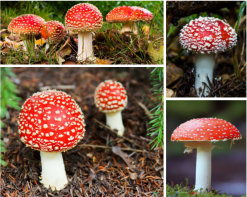
There are two new types of Photo Grids, which are a compact array of photos: Static Photo Grids and Smart Photo Grids. You can find these in the Online Content Catalog under Components > Image resources > Photo Grids. Static Photo Grid examplesStatic Photo Grids
These are aesthetically pleasing arrays of photos, but in a fixed arrangement. You can replace any photo by
Photo & Illustration Software
Release Notes
Page 6
dragging a photo file (typically a JPG or PNG) from your Windows File Explorer on top of any image in the
grid. You can then use the new photo tools described above to adjust the image with its frame, but it’s not
recommended you change the crop or size of the individual images.
Smart Photo Grids
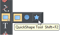
This is a more flexible SmartShape that lets you display any collection of photos, even those with different shapes and aspect ratios, in a compact grid. You can adjust the number of photos on each row, or number of rows, drag re-order the photos, and adjust the gap between all the photos. To show the SmartShape control handles, double click on the grid, or use the QuickShape Tool (Shift+F2). In the Online Content Catalog (Menu Insert > From Content Catalog.. select the category Components > Image resources > Photo Grids). All the SmartShape photo grids (as opposed to the static ones) have ‘smart’ in the title. You can also use the new photo controls on individual images, by going into the Photo Tool and clicking on an image. Each time you replace an image, it puts you into this Photo Tool mode. To get back to the SmartShape handles use the QuickShape Tool (Shift+F2) or go back to the Selector Tool and double click again.Adding & Replacing Images
To replace an image with your own photo, just drag and drop a photo file from Windows Explorer (or from the Bitmap Gallery if the photo is already in the current document). The image in the grid that you drop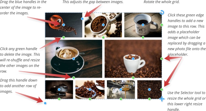
Photo & Illustration Software
Release Notes
Page 7
onto is replaced with your photo and the grid automatically updates to fit your photo in. In this first
release you can’t adjust the crop of images within the grid, but we hope an update to SmartShape photo
grids will address this.
To add more images click the green ‘Add photo’ handle on the right end of each row, or drag the
‘Add/Remove rows’ handle at the bottom left of the grid to add a complete row.
Note: The height of a row is calculated by fitting the number of images in this row into the width of the grid.
So the more images per row, the less tall that row is, especially if the images are wide such as panorama
photos. Similarly rows containing just a single image will usually be taller.
Border
There’s a Border width handle on the top left photo in the grid that lets you adjust the space between each photo. You can have no space at all if you choose, but when you do have a border it’s simply empty space between the photos so you see whatever is behind your photo grid. Therefore if you want to see something other than the page background behind, just draw a rectangle behind with the desired color.Photo Filter Presets (Updated Oct-16, Feb-17, June-17)
Photo filter presets allow you to instantly apply ready-made photo effects to your photos. The presets are provided in the Online Content Catalog under Components > Image Resources > Photo Filter Presets. You can apply them directly from the Content Catalog by selecting the photo and then choosing Insert > From Content Catalog. Below are are just a few examples of available effects, applied to the same photo for comparison. When you replace an image with a new one (using drag and drop from Explorer or right-click Replace photo…) any preset effect is retained.Using Presets From the Local Designs Gallery
Once you’ve imported one preset, you can optionally download all the presets to your Local Designs Gallery, for easier access. Open the Local Designs Gallery and navigate to the corresponding folder:
Photo & Illustration Software

Release Notes
Page 8
Components > Image Resources > Photo Filter Presets. Right click on the folder name and choose
Download All. The folder closes once it has downloaded to your disc. Re-open the folder and now you can
drag and drop any of the effects onto your photos, or select the target photo and double click an effect in
the Gallery.
Using Multiple Filters (Feb-17)
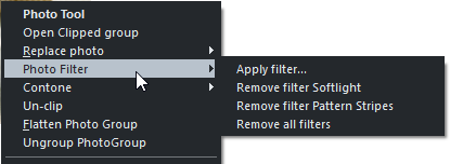
Prior to the Feb-17 update it was only possible to apply a single filter to a photo. If a different filter was applied to a photo that already had a filter, the old filter is removed and the new one applied instead. Now there are multiple different ‘classes’ of filters and overlays that can be applied together. The set of filter presets is divided into two folders under Photo Filter Presets. The Filters folder contains presets that affect the overall look of your photo. It would not be useful to apply more than one of these presets to a photo and so these will replace each other. In other words, only one of these presets can be applied to a photo and applying a second will automatically remove the first. However the Overlays folder contains various different classes of presets that can be applied in addition to any of the presets under the Filters folder. So for example this photo on the left has had the Softlight filter effect applied from Filters > Effects and also the Stripes pattern, from Overlays > Patterns. Each of the presets in the same sub-folder under Overlays will also replace each other, because it wouldn’t be useful to have for example two different patterns applied. But you can mix presets from each of the other folders under Overlays as much as you like. So you could for example apply a check pattern from the Patterns folder, a texture from the Textures folder and a transparency effect from the Transparency folder all to the same photo.Photo Filter context menu (Feb-17)
When you right-click on a photo, you will see a Photo Filter option in the context menu that appears. This option has a sub-menu, which allows you to apply filters to your photo and remove filters that are already
Photo & Illustration Software

Release Notes
Page 9
applied.
The Apply filter… option opens the Content Catalog onto the Photo Filter Presets folder so you can apply a
filter to the selected photo. Following this option in the menu, you will see Remove options for each of the
filters you currently have applied to the photo, so you can remove any of them. The final option in the menu
allows you to clear all applied filters from the photo.
Transparency Effects (Feb-17)
The overlay effects under Overlays > Transparency work by applying transparency effects to your photo directly. You can see and modify these effects by selecting your photo and going into the Transparency Tool .More Filter Presets added (Oct-16)
In October 2016 we added 50 more new photo filter presets. The set of available presets is now separated into sub-folders in the Content Catalog, but you can still download all of them to your Local Designs Gallery as described above, for easy access.More Filter Presets added (Feb-17)
Approximately 40 additional presets were added in this update, including transparency effects and the ability to apply multiple classes of filter to a photo, as descibed above.More Filter Overlay Presets added (June-17)
In this update we’ve added 10 more new photo filter overlays, these are predominantly camera effect type filters - give your social media profile pictures a great photo finish.New Blend Modes
Designer now supports 2 additional W3C standard blend modes in the Transparency Tool, Color Dodge and Color Burn. Dodge lightens images and Burn darkens them. Some of the effects in the new Effect Painter Tool use these blend modes, see below.Effect Painter Tool (Updated Oct-16)
This tool allows you to paint photo effects onto your photo. It’s based on theShape Painter and Region Painter tools, so it shares some of the same controls, such as brush size and softness controls. This if the InfoBar of the Effect Painter Tool:
Photo & Illustration Software

Release Notes
Page 10
List of effects
Transparency ‘blend’ %
Brush or nib size
Edge softness
Selecting and Applying an Effect
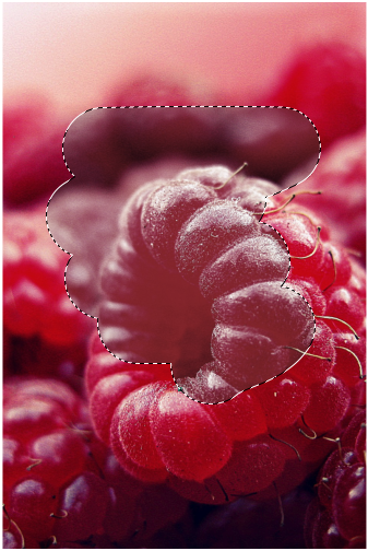
Choose the effect you want to apply from the list on the left of the InfoBar. For example the Desaturate effect will reduce the color saturation on the areas you paint onto. Choose a nib/brush size using the Size control. Note that by default, as in the Shape Painter tool, the on- screen nib size stays the same as you change the zoom, which makes it easy to zoom in and work on small detail, or zoom out and work on larger areas without also having to change the nib size. However if you prefer you can switch to an absolute nib size by clicking the Size toggle button. Use the Softness control to give your strokes a soft edge by feathering, so the edges blend into the photo, instead of having a hard edge (softness 0). When you start painting an effect, you are creating a new region shape on top of your photo.
Photo & Illustration Software

Release Notes
Page 11
Just as with the Shape Painter and Region Painter,
additional strokes on top of the existing region will
enlarge the region. Hold down Shift while you
paint and you can un-paint and so erase the edge
or any part of the shape. So it’s very easy with
these tools to paint accurately over any desired
region of the photo.
Tip: Remember using Ctrl + mouse wheel to
rapidly zoom in and out, without changing tool,
allows you to change the relative size of the brush
so you can paint in as much detail as you like.
Left: I’ve painted a region using the Desaturate-
medium effect. The ‘marching ants’ dotted outline
shows the region is selected and active still. Press
Ctrl+H to show/hide the outline.
Adjusting Painted Effects
After painting, the new effect region you created on top of your photo remains selected (‘marching ants’ outline) , so you can adjust it if required. You can adjust the strength of the effect by using the transparency slider and you can adjust the softness/feathering on the edge of the region using the feather slider on the top bar. You can even switch into the Photo Enhance Tool with the region still selected and adjust the Brightness, Contrast, etc. of your region. Back in the the Effect Painter, to paint a new region, first de-select the existing selected region. You can do this by just clicking away from the photo or by hitting the Escape key. Now when you paint you will create a new region, on the same or on a different photo, and it will have the same attributes as the last region you selected. Or just select a different effect in the Effect drop-down list. At any time you can select an earlier region by Ctrl+clicking on it. This works in the Selector Tool, or the Effect Painter or Photo Enhance tools. Once selected, you can modify it as described above. Press the Delete key to delete any selected region.
Photo & Illustration Software
Release Notes
Page 12
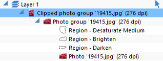
Non-destructive, Object Orientated Editing
Xara Designer is using vector-based, non-destructive editing of photos when you apply effects and regions in this way. Each region is a vector shape on top of the photo. If you use a soft brush, you’re creating a feathered shape instead of a hard edged one, but it remains an editable vector shape. All your edits are contained in a group associated with the photo - which is why the status line calls this a Photo Group. For advanced users, you can see the structure of a Photo Group in the Page & Layer Gallery. You can also use this to see and select any regions ‘inside’ your photo. The Page & Layer Gallery showing I’ve made three separate region edits to this photo, desaturate, brighten and darken. Using Ctrl+click or this Page & Layer Gallery I can select and edit these regions at any time in the future. The advantage of this approach is that no pixels of your original photo are altered. It’s easy to go back, at any time in the future, and adjust any of your previous edits. Use Ctrl+click to select inside, then using the Selector Tool you can drag the region around to see this object-oriented approach to photo editing.Minor usability improvements (Oct-16)
• Feathering/softness setting now preserved across effect type changes • Improved naming of Regions inside the Photo Groups.X Process Effects
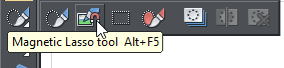
This is a new effect on on the main Photo Tool InfoBar. Cross processing simulates a photographic processing technique which historically used the 'wrong' chemicals to develop film - thus resulting in some dramatic contrast and saturation effects. Designer Pro and other photo editing programs achieve this by manipulating the red, green and blue color channels. Use the slider to experiment.Magnetic Lasso (Updated Oct-16)
Cutting objects from photos
The old Freehand Region Tool has been enhanced and re- purposed as the Magnetic Lasso Tool because it can now automatically detect outlines of objects as you trace out a
Photo & Illustration Software

Release Notes
Page 13
region. This allows you to semi-automatically trace around an object in a photo to create a region. Once
the region has been created you can copy or cut the object out, or apply an effect or enhance this region as
usual.
A frog cut out of photo, with floor shadow applied.
Tracing on a photo
First select the Magnetic Lasso Tool and then you can start tracing directly on any photo. There are two ways to trace an edge on your photo: Method 1: Click and drag around the edge. Start on the edge you want to follow. As you drag around the item you’ll see the dotted outline snapping to any nearby edge. On this example, left, you can see I started dragging at the nose and have drawn roughly around the frog, and the region outline is correctly following the frog outline. This method acts like the freehand drawing tool. You can press Shift to erase back along the path if things go wrong. Additionally pressing the space-bar will ‘anchor a point’ at the current pen position. Pressing T while dragging this way will toggle the magnet snap off or on. or… Method 2: Multiple sequential clicks. Click on the edge and then sequential clicks around the object will automatically trace the outline. If at any point the line misses the edge you wanted to follow, hit Backspace or Undo to undo the last click point. Then zoom in and click closer to the last point, on the edge you want the trace to follow. You will need to move in smaller steps along any parts of the edge that are less clearly defined, but where the edge is clear against the background you can move along the edge in much bigger steps. For both methods, pressing the Alt key while clicking or dragging will draw a straight line section from the last point to the current position. Pressing T will toggle the magnetic aspect off or on. With no Magnetic snap, then dragging acts exactly drawing with the freehand tool. Clicking with no magnet snap will just add a straight line segment to the current point.Following the Photo Edge
Sometimes you may want the outline to follow the straight outside edge of the photo. To do this, click just outside the photo edge.
Photo & Illustration Software


Release Notes
Page 14
Finishing
When you get back close to where you started, click on the start point again to complete a closed outline (the mouse pointer will change to show a + sign when you are over the start point) . Once you have a complete closed outline, you can now copy (Ctrl+C), cut (Ctrl+X) or delete the selected part of the photo. Or switch into the Photo Tool to enhance the selected region.Feathering
Once you have cut out an object, you can usually improve the edges by applying a small amount of feathering using the feather control on the top bar. During the trace operation you can turn Magnetic effect on and off using the toggle button on the InfoBar (or using shortcut key “T”).Improvements in Oct-16
The tool has been improved so that it’s now easy to toggle the Magnetic Lasso tracing on and off while drawing an outline, so you can trace difficult parts of the outline manually, where there is no edge for the auto-tracing to follow. Toggle auto-tracing on and off by pressing T, or using the toggle button on the InfoBar.Background Erase or Magnetic Lasso?
There are two ways to cut items out from the background. You can use the automatic background erase which is part of the Eraser Tool. Or you can use the new Magnetic Lasso tool to create a region around the image, which can then be cut out. Which is best? The automatic background erase feature creates a new bitmap with the background erased. This is a pixel based operation, creating a transparent (alpha-channel) image. It works best when there’s a lot of complicated detail, or soft edges where there’s not always a clear edge. Cutting around fur or hair with the Magnetic Lasso tool is impractical.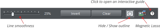
Photo & Illustration Software
Release Notes
Page 15
Take this chocolate example, where there
are lots of fiddly bits that would be almost
impossible to trace around with the
Magnetic Lasso.
Using the automatic background erase
feature (in the Eraser Tool) instead takes
only a few seconds and creates an
extremely effective result, as seen below,
where the cut out result is placed on a
different color background.
So where there is a more complex
background that either has very complex
edges, such as hair, fur or this type of
image, then the automatic background
erase would usually be better. This even
knows to make shadows semi-transparent
so they work on different colored
background.
MAGIX Photo Manager 16 (Oct-16)
MAGIX Photo Manager 16 is now bundled with Photo & Graphic Designer, making it easy to manage your image collection, with search, categorization and rating options. You can find out more about Photo Manager on our website. The download link is included in the purchase confirmation email.
Photo & Illustration Software


Release Notes
Page 16
SmartShapes
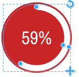
There are significant enhancements to the SmartShape system and new SmartShapes that are a lot more powerful and complex and begin to show the real power of this system. New chart and photo grid SmartShapes SmartShapes make it possible to add enhanced functionality to Designer. SmartShapes are plug-ins. We (and soon third parties) will continue to release new SmartShapes. Each SmartShape incorporates its own editing controls, usually in the form of small handles you drag to adjust the shape. Although there are simple SmartShapes that are just a single shape, such as this arrow design, the underlying SmartShape architecture now supports much more complex examples, including charts and percentage segment indicators, grids of photos that can be customized and improved smart text panels. Some examples of percentage segment SmartShapes. In the Text Tool you can enter a new value and the segment adjusts. Or drag on the chart and the value adjusts. These SmartShapes are automatically matched to your document Theme Color. SmartShapes are entirely self-contained. No new tools are required. You just double-click on the SmartShape (or select the QuickShape tool) to reveal its editing controls.
Photo & Illustration Software


63%


201
576
408
271
486
Alpha
Bravo
Charlie
Delta
Echo

40%
70%
59%
Release Notes
Page 17
Improved SmartShape editing
Photo & Graphic Designer now shows larger and clearer handles on SmartShapes when editing. You can edit SmartShapes simply by double-clicking on the shape in the Selector Tool. Alternatively, select them using the QuickShape (or rectangle or ellipse) Tools from main tool bar. When selected the SmartShape will show a set of control handles on and around the shape, like this: This is a simple Text Panel SmartShape. The blue circular handles on the sides allow you to stretch the panel to be any size. The top right corner handle will rotate the whole object. The bottom right will enlarge or reduce the size of the whole SmartShape. Each SmartShape has its own set of control handles. Hold the mouse-pointer over any handle to get a tool-tip hint of the function of each. The Status Line (bottom of window) also provides some description of the function of each handle. In this example the top left orange handle adjusts the rounded corner of the panel background (and most rectangular SmartShapes have a similar function). The inset handle at the top right, in this case, adjusts the margin around the text. This percentage segment SmartShape has controls to drag either end of the segment (doing so will update the value), or using the Text Tool you can edit the value, in which case the segment bar is changed. The handle mid-way around the arc allows you to adjust the thickness of the band. The top right handle will rotate the whole thing, the lower right will resize it. When you insert a SmartShape, many of the colored ones will take on Theme Color 1 of your document (in this document a dark red).SmartShape Handle Mouse Pointers (Feb-17)
Improved mouse pointers shown over SmartShape handles.Chart SmartShapes
The Online Content Catalog includes new charting SmartShapes, with bar, column charts and a variety of circular ‘percentage’ indicators. The menu Insert > Charts is a short-cut to the chart category. You can just edit the values and labels on the charts using the Text Tool and the graphics update accordingly. Or you can
Photo & Illustration Software
Release Notes
Page 18
drag the graphics and the values update.
When we add new SmartShapes they will appear in the Online Content Catalog automatically.
As with all SmartShapes, double-click on the SmartShape to go into the QuickShape tool and reveal the
control handles.
Instead of complex dialogs, or charting tools, almost all aspects of chart SmartShapes can be adjusted by
simply dragging on the control handles, or directly editing the labels and values. Below is an annotated
diagram of the controls.
Move the mouse pointer over each handle for a tip on what each does.
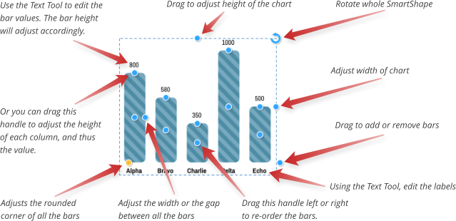
Photo & Illustration Software

576
1420
720
1047
1222
871
Alpha
Bravo
Charlie
Delta
Echo
Foxtrot
800
580
350
1000
500
Alpha
Bravo
Charlie
Delta
Echo
59%
Release Notes
Page 19
Entering precise chart values: You can drag the bars to adjust the value. If you need more resolution or
accuracy, just zoom in and drag. Alternatively you can enter any precise numeric value, even with decimal
places, using the Text Tool.
The example chart SmartShapes are quite simple, but we anticipate that we, and third parties, will release
more powerful charting SmartShapes over time. These will just appear in the Online Content Catalog as we
make them available.
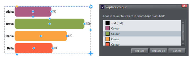
Customizing Bar & Column Chart Colors and Text
You can change the colors of charts easily just by selecting the whole chart and clicking a color on the color line or dragging a color onto the SmartShape. The Replace Colors dialog appears to let you choose which of the colors in the chart you would like to replace with your chosen color. Alternatively use the Color Editor to edit the colors - the list of replaceable colors appears at the top of the color editor, so select the color you want to edit from that list. Sometimes you may need to do more than just replace or edit the existing colors in the chart. You can select a specific bar or column inside the chart using the normal ‘select inside’ short-cut of Ctrl+clicking on it in the Selector Tool. That selects just that bar/column inside the chart. Then you can change its color directly, or its outline, or even change the type of its fill using the Fill Tool. If you want to copy the style of one bar onto the other bars, first copy (Ctrl+C) the selected bar to the clipboard. Then select one of the other bars and use Edit > Paste > Paste format/attributes or the simpler short cut Ctrl+Shift+A.Bar & Column chart label and value text (June-17)
Now when you change the appearance of a chart label, such as changing the font, font size or color, that change is immediately replicated across the other labels for each bar. However this only happens if those other labels have the same text style applied (usually “Bar chart labels”). So if you want one of the labels to be different, perhaps to highlight one of the bars, simply give it a different style or use the No style option in the styles menu to remove the style. The same happens with the value text.
Photo & Illustration Software
Release Notes
Page 20
New Text Panel Designs
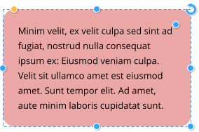
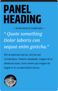
In the Online Content Catalog you can find some new Text Panel SmartShapes (short cut menu Insert > Shapes > More Text Panels… but they are also under the Components > Print & Web Components in the Online Content Catalog. These text panels are smart in that they grow to accommodate whatever text you put in them - you can freely edit the text using the Text Tool. If you display the SmartShape controls (double click on it using the Selector Tool or the QuickShape tool) you can adjust the width and height (and the text re-flows), the margins around the text and the roundness of the corners of the whole panel. You can also rotate the whole object and it remains fully functional. In addition we have a collection of similar panels containing photo and text. You can find these in the Online Content Catalog under Image resources > Photo Panels.Vertically Aligned Text Panels (June-17)
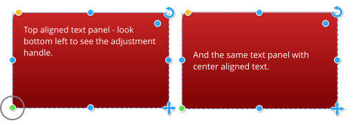
Text Panel SmartShapes now include an additional handle that allows the vertical alignment of the text to be changed between “top” and “centred”. Just click the handle in the bottom left corner to toggle the alignment. Note that the new handle only appears if there is some vertical space in the panel above/below the text. Otherwise, if the text fills the panel, changing the vertical alignment would have no visual effect
Photo & Illustration Software
Release Notes
Page 21
Photo & Illustration Software
Packed Photo Grid
See the Photo Features section above for details of these new SmartShapes for arranging photos in grids.New Simple SmartShapes
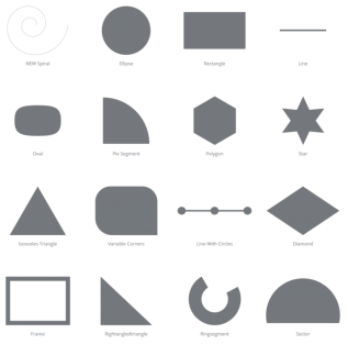
There are also some new simple SmartShapes available from the Online Content Catalog in the Shapes category (Short-cut menu Insert > Shapes > More Shapes…) Each of these is a customizable by dragging on the SmartShape handles. You can now vary the number of sides on the spiral SmartShape, and vary the spacing to be non-linear to produce 3D effects such as this.New Chevron Bar Smartshape (Oct-16)
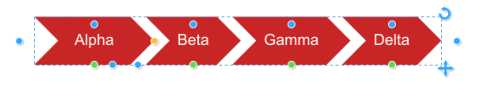
The new Chevron Bar smartshape (Insert > Shape > Arrows…) is particularly useful in presentations. Drag on the different handles to add/remove chevron shapes, re-order, change the arrow angles, etc. And of course just click on the text in the Text Tool to edit the labels.

Release Notes
Page 22
Photo & Illustration Software
New Arrows (Feb-17)
Most of the arrows in the arrows folder (Insert > Shape > Arrows…) can now be changed to use a variety
of different head and tail designs. Click or drag on the green style selection handles to cycle through all the
available styles.
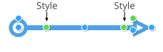
New Timeline SmartShapes (June-17)
Timelines are common in many types of documents and particularly in presentations. The Timeline Smartshape consists of a line with an object (or group of objects) repeated along its length with regular spacing. You can increase or reduce the number of objects on the line, adjust their spacing, size, vertical alignment, etc. using the SmartShape’s handles. To insert a Timeline, use Insert > From Content Catalog > Components > Print & Web Components > Timelines.Timeline Handle Summary
End handles Drag either end to change the length of the line, or rotate the whole line Spacing Drag to adjust the spacing of the objects on the line and therefore determine how much of the line sticks out on each end. Add/Remove Click to add a copy of the rightmost object, or drag to add or remove multiple objects. If nothing happens when you try to add a copy, that means there is not enough space on the line to fit another copy. Try reducing the size of the objects using the Size handle, or extending the line length by dragging it out. Vertical offset Drag to adjust the vertical positioning of the objects on the line. Delete Delete an object from the line. Line width Drag to adjust the width of the line Size Change the size of the objects on the line.


2014

2015

2016

2017
Release Notes
Page 23
Photo & Illustration Software
Text Editing
Many of the timelines include text, which of course you can edit using the Text Tool. If you find you can’t fit the text you want into the space available, try increasing the size of the objects on the line using the Size handle and then select the text and reduce its font size, so you can fit more text in. If the change the font size of all the text on one object, you should see the text on all the other objects update too, to help you choose the size that fits best.SmartShape API for Developers
SmartShapes are a way of extending the functionality of the Designer series of applications. The examples shown here are just a sample of what’s possible. If you’re a developer we’ll soon be releasing the plug-in API so you can start adding your own SmartShapes, or just enhancing the existing SmartShapes, as we expect to release the source code of most of the SmartShapes we’ve created. If you’re interested in learning more about this, email us at smartshapes@xara.com and we’ll make sure you get information when we launch this to the outside world.Online Content Catalog
New Design
Release Notes
Page 24
Photo & Illustration Software
An enhanced Online Content Catalog is included free for one year as part of our new Update Service. It
now offers:-
•
Regular updates to the templates and content as part of the Update Service
•
Full keyword search of the entire catalog
•
A new more logical structure to the content offering a better work flow
•
Brand new Stock Photos and Stock Illustration sections - see below.
Keep Content Catalog open after selection (Oct-16)
Normally when you click on the Import button over the item you’ve chosen in the Content Catalog, the item is imported and the Catalog window closes. Now if you hold the Shift key down when clicking Import, the item is imported and the Catalog is kept open. This is useful if you want to try out several different items without having to keep re-opening the Catalog.Keyword Searching
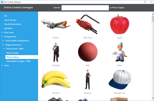
All content is now searchable, making it much easier to find templates and components to add to your document or website. Select a category folder on the left and then enter a keyword in the search field to search in that category only. Or select All on the left to search all available content.Stock Photos (updated Oct-16)
This is unlike most stock photo libraries you may be used to, where you purchase a ‘royalty free’ image, with restricted license terms, often with limited production runs, limited reproduction rights, no re-distribution rights. An increasing number of photographers are submitting their work to the public domain, in particular under a license called CC0, which is a very liberal license, totally royalty free, where you can use the image for personal or commercial use with almost no limitation. Read more about the CC0 license. In conjunction with Pixabay, a website that collected and collated a huge number of high quality CC0 images, we have included a section in the Content Catalog where you can search and download hi-res photos directly into Designer. Their collection includes high-quality images from sites such as Unsplash.com and other collections of CC0 licensed content. The first time you import one of these photos you will be asked to read and accept Pixabay’s Terms &


Release Notes
Page 25
Photo & Illustration Software
Conditions. But you only need to do this once on each computer you use, then you can import as many
photos as you like.
Download high resolution photos (Oct-16)
Before this update photo resolution was limited to HD (1920x1080), but now when you import a stock photo into a print document you get the photo’s full resolution into your design. The resolution of photos varies, but most are much higher than HD resolution. When you import into a web document, as when importing local photos, the resolution is still limited to HD because it’s rare to need any higher resolution than this for a website.Stock Illustrations (Oct-16)
In addition to stock photos, there’s now an additional category of vector graphic ‘stock illustrations’. All the images have keywords so you can easily search for the graphic you want. Select the Stock Illustrations category on the left side and enter a search term, such as Frog - see left. Because the original vector files vary enormously in size, graphics larger than around 300px are scaled down. Also un-grouped images, are placed in a group for ease of manipulation. Because this is vector clipart, it’s re-sizable to any size without loss of quality.Local Designs Gallery
The Designs Gallery has now become the Local Designs Gallery. As the name implies, this now shows only content that you have present locally on your device, either because it was installed with the program using the optional backup CD, or was downloaded from the Content Catalog. This makes it easier to find and access designs you use regularly. The folder structure in the gallery still mirrors that of the Online Content Catalog and each folder in the gallery has a link allowing you to jump straight into the corresponding folder in the Content Catalog, so you can easily view what other content is available for download into that folder. Whenever you open or import a design file from the Catalog, that file then appears in the Local Designs Gallery and so you can use it even when offline.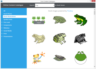
Release Notes
Page 26
Photo & Illustration Software
Download Content to be Available Offline
As just mentioned the Local Designs Gallery now shows content that has been previously downloaded, that is cached on your local hard drive. This is therefore available while working offline. For example if you download a button from the Online Content Catalog (from Components > Print & Web Components > Buttons) then there will be a corresponding category created in the Local Designs Gallery. You can download the whole category (in this case all the button designs), so they are all available offline, by right clicking on the category name, and selecting the ‘Download All’ option.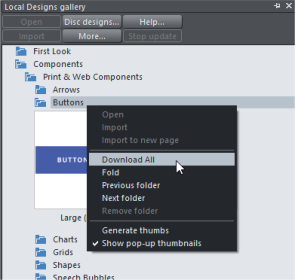
Release Notes
Page 27
Photo & Illustration Software
Symbol Library
The Symbol library is a great source of high quality vector icon symbols, and we’ve made it even better. We’ve added Google’s Material Designs symbol font to the library (menu Insert > Symbol… and also from the Content Catalog) to provide over 1500 high-quality open-source vector symbols. These can be used as editable vector graphics on the page, or inline symbol font characters in text. To insert the symbol in the text, in the Text Tool, just place the text caret where you want to insert the symbol and select the symbol from the picker. If you insert the symbol on the page, it’s created as a simple vector shape. You can adjust its fill, shadow, outline and shadow using the usual tools.Automatic Updates
The Font Awesome and Google Material Design fonts are updated quite regularly with new symbols. When this happens you’ll be prompted when you open the symbol picker. It’s important that you choose to accept these updates because the symbol picker and Content Catalog always show symbols from the newest font versions, so if you’re not up to date you may find symbols you choose appears as a black rectangle.Symbol Search
The symbol library is now searchable - enter a keyword in the search field at the top of the symbol picker to find matching symbols in any of the symbol fonts supported. e.g. search for ‘face’ to find all Facebook icons, or ‘credit card’ to find all credit card designs.Replace Symbol
To replace a symbol, right-click on it and choose Replace symbol… from the context menu. This brings up the symbol picker, where you can search for a new symbol. Place the text caret in the list, right-click and choose Replace symbol… Use the List Properties dialog to replace bullet symbols in bulleted lists. June-17 update- this now also works if the symbol is inside a group so you don’t have to perform a “select inside” operation first.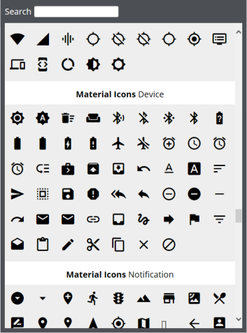
Release Notes
Page 28
Photo & Illustration Software
Text Handling Improvements
Ligatures (June-17)
Many modern OpenType fonts include typographical ligatures, which allow pairs or sequences of consecutive characters in text to be displayed with a single glyph. They are used to improve the legibility and presentation of text and to introduce stylistic flourishes. Some fonts have very few or no ligatures, others have many and may also include multiple Stylistic Sets (see below). Ligatures are organised into the following groups and you can choose which groups to turn on or off independently for any range of characters. Select a character range in the Text Tool and then click on the button on the end of the Advanced Text bar, to access the ligature options. Under the Open Type Ligatures option, you can select any or all of the following groups, for the current selected characters: Standard The default set of ligatures the font designer has provided. Discretionary Discretionary ligatures are usually decorative - to be applied at the discretion of the user. Historical Historical ligatures are mainly ornamental suggesting a historical context.Stylistic Sets
Some fonts include alternative sets of ligature characters that the user can choose from, allowing more flexibility. If any sets are available for any of the characters in the current text selection, they are listed under the Stylistic Sets sub-menu, where they can be turned on and off independently. Ligature settings can be used in text styles just like other text attributes.Hidden Text Styles (June-17)
Text styles can now be marked as “hidden” in the text styles properties dialog, which means they won’t

Release Notes
Page 29
Photo & Illustration Software
appear in the main styles list unless the text caret is located in text that uses that style. This is useful to
help avoid the styles list becoming too long in documents that use a lot of different styles. Some
SmartShapes such as the bar and column charts have their own text styles and these are now
automatically made hidden styles, so they don’t appear in the main styles list. Similarly the TOC styles used
for Tables of Contents are also hidden. Use the “Show hidden styles” option in the styles menu to have all
styles included in the styles list.
Additionally hidden styles can’t become current, so any new text you add to a design should never use a
hidden style by default.
Improved support for multi-weight fonts (June-17)
We’ve made some significant changes to the way that Designer handles multi-weight fonts. Prior to this update if a font was updated so that it’s multiple weights were presented in a different structure, this could cause Designer to show missing font warnings for documents that had been created using the previous version of the font. Now any such changes to a font should be transparent, so you can update to a newer version of the font without encountering any problems with existing documents that use that font. This update also has improved handling of the Bold button with multi-weight fonts. Prior to this update, Designer would not allow bold to be turned on if the selected text used anything but the regular variant of a font. Now it will work with any variant, automatically choosing the most appropriate heavier weight variant of the same font. For example if you have some Open Sans Light text selected and you press the Bold button, the text will appear as Open Sans Regular.Rectangular Repelling Option
If you make a non-rectangular object repelling, by default the text flow s tightly around the object, following its outline, as demonstrated by this e llipse on the right. Now you can choose to make the text repel around the rectangular bounding box of the object instead, ignoring its outline, as for the second ellipse below left. This rectangular repelling option is also more efficient if your document has long text flows and a lot of repelling objects that are also anchored to the text (as both ellipses here are). Therefore this is now the default option when you turn repelling on for rectangular objects. Non-rectangular objects, such as the above ellipses and transparent PNGs default to ‘tight’ repelling around the shape, or transparent parts of a PNG bitmap.

Release Notes
Page 30
Photo & Illustration Software
You can control the repel margin - how close the text comes
to the edge of the repelling object.
You can access this dialog by right clicking on the item to
repel, and selecting the Repelling & Anchoring… option,
which also appears under the top level Arrange menu.
OpenType Font Kerning
Auto-kerning (the small adjustment of the overlap of certain pairs of letters such as ‘Aj’) in earlier versions of Designer works only with older TrueType fonts. Work has been done to support kerning on newer OpenType fonts, so now many newer OpenType fonts render with the correct kerning.Change Case of Selected Text
Right-click on a text selection in the Text Tool and choose from the new Change case to… sub-menu in the context menu.Change Language for Entire Document
The spell-checker menu now includes options to change the language of all text in your document at once, instead of having to set each text object separately.New Advanced Text Toolbar
In previous versions of Designer, the Text Tool InfoBar had a flyout bar on the end, which gave access to additional text controls that wouldn’t fit on the main InfoBar. Alternatively users could choose to have an extended Text Tool InfoBar, containing all controls. We’ve now replaced both these options with an additional toolbar which you can turn on and off using the button toggle button on the end of the Text InfoBar. When turned on, the additional bar only appears when you are in the Text Tool. By default the bar appears below the InfoBar, but as with all bars in Designer, you can drag the bar to another location. If you have a wide enough screen you may wish to move it to the right side of the InfoBar.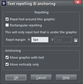


Release Notes
Page 31
Photo & Illustration Software
Bullet & Numbered Lists
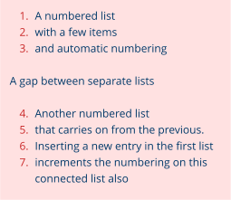
Extended List Properties Dialog (Oct-16)
The List Properties dialog has been extended so that it now gives you much more control over how your bulleted and numbered lists are presented, so it’s now much easier to get lists looking how you want. To bring up the dialog, place the text caret in the list or sub-list that you want to modify, right-click and choose List properties … from the context menu. The dialog is non-modal and all the changes you make are applied immediately, so you can move the text caret to different lists/sub-lists at any time. The first two fields in the dialog are as in previous versions of Designer and allow you to change the number format and starting values in numbered lists. Link to previous list of the same level (Oct-16 & Feb-17) It’s now possible to connect two separate numbered lists so numbering of the second list carries from the last number used of the previous list. This allows you to insert gaps, graphics, other paragraphs in the middle of lists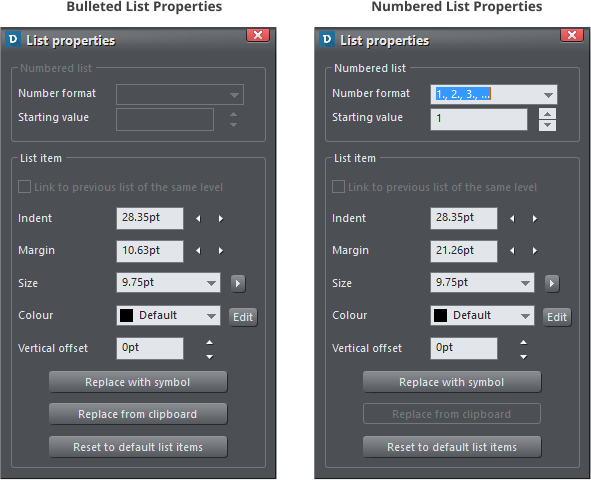
Release Notes
Page 32
Photo & Illustration Software
In order to connect a list to a previous one, right click on the list
and select the menu ‘List Properties…’, to open the list
properties dialog (see screenshots above).
Check the ‘Link to previous list’ option to link lists. When you do
this the lists will take on a common numbering format.
Size
This field allows you to change the size of the number or bullet
character for the list or sub-list at the caret.
Color
Change the color of the bullet or number. You can either select a named color from the drop-down list, or
click the Edit button and use the color editor to choose a color. Once you have opened the color editor in
this way you can also click on any of the colors on the color line, if you want to choose a standard color.
In the Feb-17 update the use of this option was extended to also work with bulleted lists and sub-lists.
When the option is checked, the current list picks up its settings from the previous list at the same level and
of the same type. So set this option on a bulleted sub-list and it will pick up the bullet symbol, margin,
indent, color, etc. settings from the previous sub-list of the same level.
Vertical Offset
This option allows you to adjust the vertical offset of the bullet/number relative to the list text. This is
particularly useful for bullet symbols because the vertical positions of these vary, so depending on which
symbols you choose for your bullets (see below), you will often find they don’t align nicely with the list text.
So use this vertical offset facility to adjust the alignment.
Indent
The indent is the space to the right of the numbers/bullets (the space between the numbers/bullets and
the start of the list text). So you can use the Indent controls to adjust this spacing for the list at the caret.

Release Notes
Page 33
Photo & Illustration Software
Margin
The margin field controls the space to the left of the bullet/number, so you can use these controls to
adjust the horizontal offsets of sub-lists.
Replace with symbol
This button is enabled for bulleted lists only and allows you to choose a different symbol for the list. It
brings up the symbol picker window, which lets you choose from hundreds of different symbols. You can
also search by keyword if you are looking for a particular symbol. If you choose any of the Material Icons
symbols, you will probably need to adjust the vertical position of the symbol, as described above. Here’s an
example:
A list using a graphical bullet symbol from the
Symbol library.
In this case the symbol can be found searching for
‘bullseye’.
In addition the bullets have been colored red and
had a vertical position adjustment.
A great benefit of using Symbols this way is that they are just characters from a symbol font, and so zoom
without quality loss, are resolution independent and look good on high-res devices such as Retina screens.
Replace from clipboard
Designer allows you to use any graphic for your bullets or numbers in lists. Search for “Graphical bullets” in
the help for details on how to do this. The Replace from clipboard button in this dialog does the same as
the Paste as list bullet and Paste as list number operations in the context menu.
Other list editing improvements (June-17)
Various other small list editing improvements and fixes have been made in this update.Other Text Improvements
• A Delete Style operation has been added to the styles menu. So you no longer need to locate and remove every reference to a style in order to remove it from your document. (Oct-16) • Accidentally joining paragraphs of different styles and separating them again is more reliable. (Oct- 16) • Improved positioning and size of subscripts and superscripts.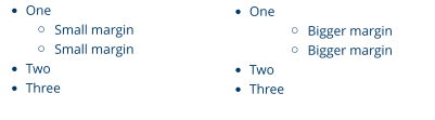
Release Notes
Page 34
Photo & Illustration Software
•
(June 2017) ‘No style’ is now included in the Name Gallery style list
Page & Layer Gallery
Object Naming
You can now give names to the individual objects in the Page & Layer Gallery, to help find objects and to organize your designs. Change object names the same way you change layer and page names in the gallery - just click on the name while the object is selected in the Gallery, or right-click on it and choose Rename object.Import/Export
Improved Photoshop (psd) Import and Export
In previous versions of Designer, when you exported a design as a psd file, each Xara layer in the design became a separate layer in Photoshop. And similarly when importing a psd file, each psd layer became a Xara layer in Designer. Now we map psd layers to and from Xara objects instead of Xara layers. This is a better fit between the two applications, because whereas in Photoshop effects and blend modes are applied to whole layers, in Xara the same tools are applied to objects, not layers. So it’s more useful to map Xara objects to and from psd layers.Improved PDF Import
• Generally improved text reconstruction, including better justification detection and line spacing accuracy. • Clipview optimization (removal of unnecessary clipviews). • Improved import of bulleted/numbered lists. • Many other small improvements (more in Oct-16 and June-17 update).Improved Word Import & Export
• Import of diagrams (SmartArt objects, art borders, picture effects and other constructs). • Many other small improvements to both import and export (more in Oct-16 and June-17 update).Improved RTF Import & Export
Improved import of shapes, hyperlinks, text styles, gradients, transparency and many more improvements.Improved SVG import (Oct-16)
SVG blur effect import improvement and other general minor enhancements.
Release Notes
Page 35
Photo & Illustration Software